Accessible Design Systems: The Scalable Inclusion Strategy Every Brand Needs
Accessibility without a design system is just firefighting. Brands that build accessible components once into a unified design system are launching faster, ranking higher, and earning deeper user trust.
Consistency Meets Inclusion
Over 96% of the world’s top one million websites still fail basic WCAG accessibility standards. That statistic should concern every business leader, not because of legal exposure, but because it signals a massive gap between digital ambition and digital reality.
Accessibility has moved from post-launch checklist to foundational requirement. At the same time, design systems have crossed from “nice to have” into strategic infrastructure. The two are not separate conversations. They belong in the same room.
Here is the insight that changes how you build: a design system is the vehicle for scalable accessibility. Without one, accessibility is a manual, reactive, never-ending task. With one, it becomes something you solve once and deploy everywhere.
This is the intersection of efficiency and ethics. And in 2026, the brands that understand it are pulling ahead.
Why Design Systems Make Accessibility Scalable
The logic is clean.
Build an accessible button component once. Document it. Drop it into your system. Now every button across every page, every campaign, every new feature launch is accessible by default. No individual checks. No retrofitting. No surprises.
This applies to every core UI element: forms, navigation menus, modals, filters, cards. When accessibility is baked into the component layer, it travels with the component. Every new page your team builds inherits the work you already did.
Consistency also builds trust.
Users who encounter unpredictable interfaces, color schemes that shift, navigation that behaves differently across pages, form errors with no guidance, lose confidence in the brand behind the experience. Inconsistency is not just a UX problem. It is a brand problem.
The alternative is painful.
Companies that skip the system approach end up running emergency remediation across hundreds of pages. One prominent retail enterprise discovered over 1,400 accessibility violations spread across its site after a legal complaint. The remediation took months and cost significantly more than building the system correctly from the start would have.
Microsoft’s Fluent Design System is a well-documented example of the right approach. By embedding accessibility at the component level, including keyboard navigation, high contrast support, and screen reader compatibility, Microsoft ensured that accessibility scaled across its entire product suite without requiring individual teams to solve the same problems repeatedly.
Build once. Deploy everywhere. That is the only way accessibility scales.
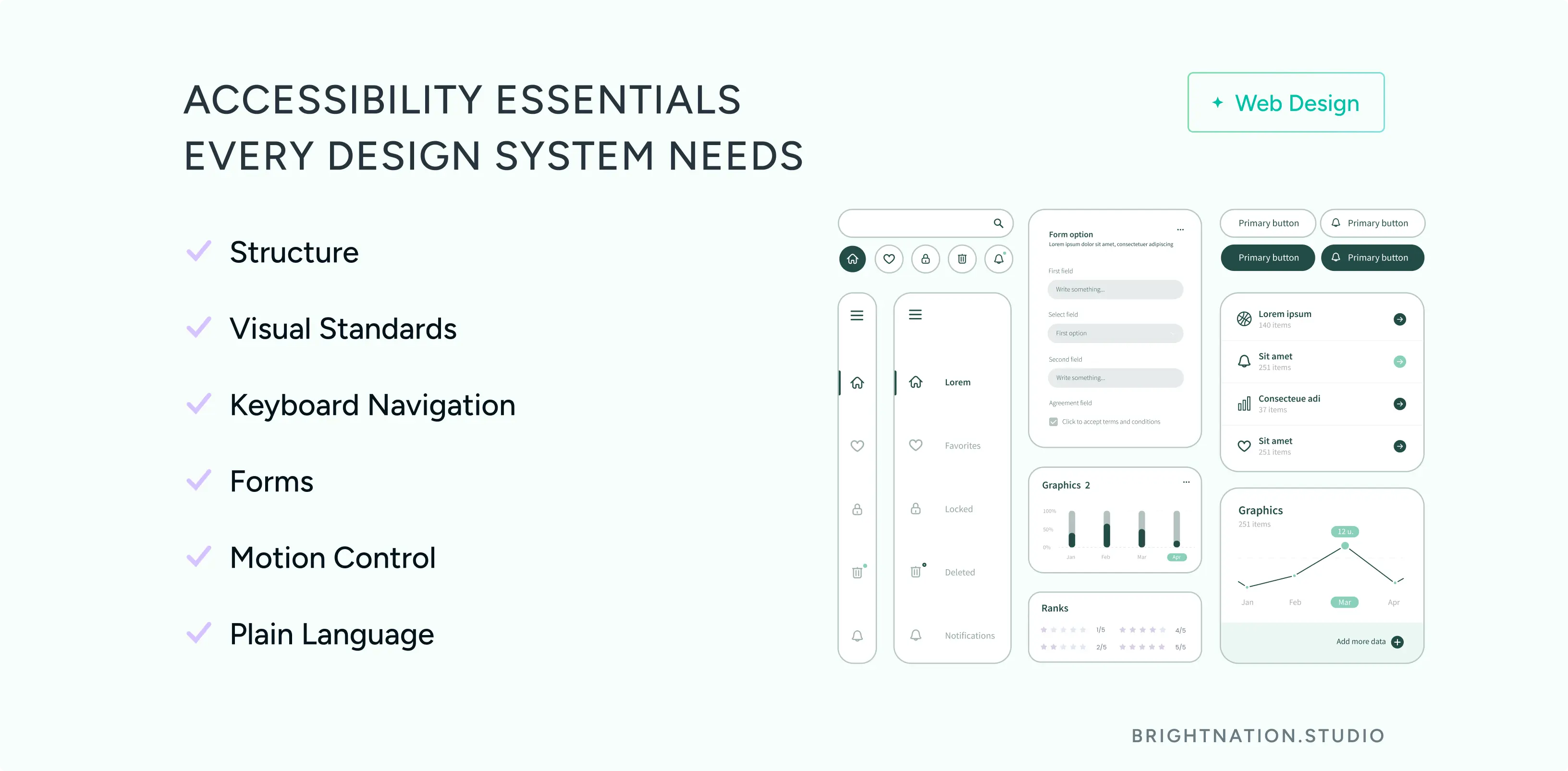
The Accessibility Essentials Built Into Your System
A well-built accessible design system covers six non-negotiable areas.
Structure. Proper heading hierarchy (H1 through H6) is not just a screen reader requirement. AI-powered search tools now parse heading structure to understand page content and relevance. A clean hierarchy improves both human navigation and algorithmic comprehension. Accessible structure is SEO infrastructure.
Visual standards. Contrast ratios must meet WCAG AA minimums (4.5:1 for body text). Typography needs to be legible at default sizes. Light and dark mode support should be built into the token layer of your system, not bolted on later.
Keyboard navigation. Every interactive element, menus, modals, dropdowns, filters, date pickers, must be fully operable without a mouse. This matters for users with motor disabilities, power users who prefer keyboards, and any context where a mouse is unavailable.
Forms. Clear labels, visible focus states, and helpful error messages are not cosmetic choices. They directly reduce form abandonment and increase conversion rates. A form that fails to explain what went wrong loses the submission. A form that guides the user through the error keeps it.
Motion control. Users with vestibular disorders can experience physical discomfort from animations. Your system should respect the prefers-reduced-motion media query and give users control over animated elements.
Plain language. Inclusion starts with readable content. If your copy requires a graduate-level reading ability, you are excluding a significant portion of your audience. Plain language guidelines belong in your design system documentation alongside your visual standards.
Taken together, these elements do not just serve users with disabilities. They improve the experience for everyone and send the right signals to every system, human or algorithmic, that evaluates your site.
Let’s get started! Contact us today to discover how we can help.
The AI Edge: Systems as Guardrails
Your design system is the guardrail. When AI tools are trained on or constrained by your documented system, every output stays on-brand and accessible by default. The speed benefit of AI is preserved. The quality and compliance risk is managed.
The ROI compounds quickly. Organizations with mature design systems report up to 47% faster time-to-market for new digital products. Faster launches mean faster revenue. Reduced remediation means lower maintenance costs. Accessible, consistent experiences drive higher conversion rates and stronger SEO performance.
This is not a theoretical benefit. It is a measurable competitive advantage.
Is Your Design System Accessibility-Ready?
Before your next launch, run through this checklist.
- Accessible components documented and reusable across your product
- Contrast ratios meet WCAG AA standards (4.5:1 for body text, 3:1 for large text)
- Keyboard navigation tested on all interactive components
- Form patterns include clear labels and actionable error handling
- Motion controls available for users who need reduced animation
- Plain language guidelines included in your documentation
If any of these are missing, you are not just carrying compliance risk. You are leaving performance, trust, and growth on the table.
At Bright Nation, we build design systems that make inclusion the default, not the exception. If your current system is not doing that work for you, let’s change that.