Simple Website Design, Deep SEO: The Psychology Behind Getting Both Right
Your brain wants simplicity. Search engines want depth. Most businesses sacrifice one for the other and pay for it in bounce rates or buried rankings. The UX psychology SEO balance isn’t a compromise. It’s a strategy.
The Double-Edged Sword of Simplicity
Minimalism sells. Clean layouts, white space, and frictionless navigation have become the gold standard of modern web design — and for good reason. Users respond to clarity. Load times drop. Conversion paths tighten.
But there’s a tension hiding inside that clean aesthetic.
The human brain craves low cognitive load. Search engines, on the other hand, need substance. They crawl for content depth, internal linking, keyword context, and structured data. A site that feels beautifully simple to a visitor can look dangerously thin to a crawler.
The businesses winning on both fronts in 2026 aren’t choosing between UX and SEO. They’re using psychology to engineer sites that feel simple to humans and read as rich to search engines. That’s the real discipline: understanding the cognitive science behind great design and the technical logic behind discoverability, then building the overlap.
Here’s how it works.
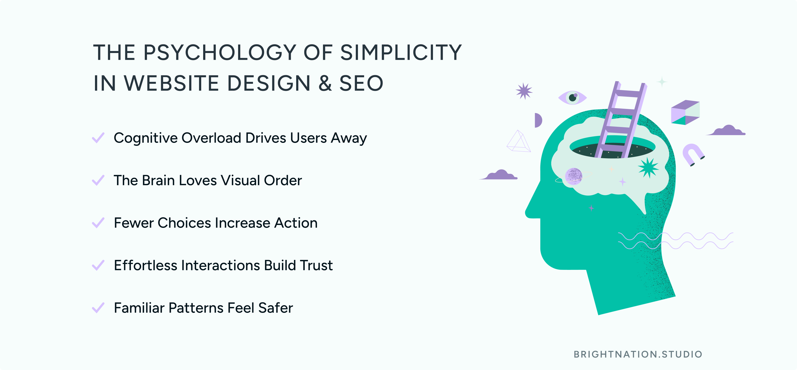
The Psychology of Simplicity (Why Less Feels Better)
Great UX doesn’t happen by accident. It maps to the way the brain actually processes information.
Miller’s Law: Your Users Can Only Hold So Much
Cognitive psychologist George Miller established that working memory handles roughly 7 items (plus or minus 2) at a time. Overload it, and users don’t slow down to process — they leave. Studies consistently show that high cognitive load correlates directly with higher bounce rates. One analysis found that pages with cluttered layouts saw bounce rates increase by up to 38% compared to streamlined alternatives.
The practical takeaway: every element on a page competes for limited mental bandwidth. If your homepage is doing ten things, it’s effectively doing none of them.
Gestalt Principles: How the Brain Groups What It Sees
The brain doesn’t read a page element by element. It groups visual information by proximity (things close together feel related) and similarity (things that look alike feel like they belong together). Designers who understand this can organize content so users process it almost unconsciously, without friction.
When your service cards are evenly spaced with consistent styling, visitors don’t have to think about what’s a category and what’s a CTA. The brain just knows.
Hick’s Law: Fewer Choices, Faster Decisions
Hick’s Law states that decision time increases logarithmically with the number of options. Each additional choice slows a user down. Amazon understood this early. Their “Buy Now” button exists precisely to eliminate the hesitation that comes from five competing CTAs. One clear action, one clear path.
For your navigation, this means fewer items, not more. Five focused links outperform ten sprawling ones every time.
Fitts’ Law: Size and Distance Drive Clicks
Fitts’ Law tells us that the time to reach a target depends on how large it is and how far away it sits. On mobile, this is non-negotiable. The minimum recommended touch target is 44px by 44px — anything smaller forces users to aim carefully, which creates friction. Larger, centrally positioned buttons are clicked faster and more confidently.
Mental Models: Match What Users Already Expect
Users arrive at your site with pre-built assumptions based on every other site they’ve visited. A shopping cart icon means cart. A floppy disk means save. A magnifying glass means search. These are mental models, and violating them costs you trust instantly.
Schema theory in cognitive psychology supports this: the brain processes new information by mapping it to existing frameworks. When your design matches those frameworks, interaction feels effortless. When it doesn’t, confusion follows — and confusion converts to exits.
The insight here is simple: great UX doesn’t feel clever. It feels obvious. That’s the goal.
The SEO Paradox: When Simple Becomes Too Simple
Here’s where many well-intentioned redesigns go wrong.
A brand strips back its site for a cleaner look. The homepage becomes a hero image and a tagline. Service pages shrink to three bullet points. The blog disappears. Navigation collapses to four items. It looks stunning.
And then organic traffic drops.
Search engine crawlers don’t experience your site the way users do. They read it. And a page with minimal text, no internal links, and shallow descriptions reads as thin content, which Google actively deprioritizes. No blog means no topical authority. Vague service descriptions mean no keyword relevance. Missing internal links mean crawlers can’t map your site’s structure.
The fix isn’t adding clutter. It’s layering depth intelligently.
What the Front-End Hides, the Back-End Must Provide
Visual simplicity and content depth are not mutually exclusive. Nuvolo, an enterprise asset management platform, runs a clean, clutter-free interface while maintaining strong organic rankings through well-structured service pages, a consistent content strategy, and tight internal linking. Treehouse Almonds achieved a meaningful SEO lift through a redesign that prioritized descriptive URLs, clear category architecture, and rich product content — without sacrificing the premium aesthetic their audience expected.
The architecture behind a simple site matters enormously
Descriptive URLs that tell crawlers exactly what a page covers
Clear category structure that creates topical clusters
Internal links that connect related content and distribute authority
Rich media (video, infographics) with proper alt text and schema markup
Comprehensive page copy that answers the questions users are actually searching
Clean design also delivers an indirect SEO benefit. When users feel understood by a site, they stay longer. Dwell time is a positive ranking signal. A site that earns trust through good UX keeps visitors engaged, and that engagement tells search engines the content is worth surfacing.
The Ethical Balance: Nudges vs. Dark Patterns
Psychology is a powerful design tool. It can also be misused.
Ethical Nudges That Serve the User
The Default Effect is one of the most well-documented nudges in behavioral economics: people tend to stick with pre-selected options. Pre-selecting standard shipping, a recommended subscription tier, or a helpful notification setting reduces friction and guides users toward choices that genuinely serve them.
Recognition over recall is another ethical principle. Labeled icons, intuitive navigation labels, and familiar UI patterns reduce the mental effort required to use your site. Users shouldn’t have to remember how your site works — they should recognize it instantly.
Visual hierarchy guided by Fitts’ Law directs attention to the primary action naturally, without forcing it.
Dark Patterns: The Short-Term Win That Destroys Long-Term Trust
Dark patterns weaponize the same psychology. Hidden opt-out buttons exploit inattention. Loss aversion guilt-trips (“Are you SURE you want to miss this deal?”) manufacture anxiety. Deliberate choice overload pushes users toward a default through confusion rather than clarity.
Research from the Norwegian Consumer Council and Princeton University found that dark patterns are pervasive across major platforms — and that users who recognize them report significantly lower brand trust and are far less likely to return. The short-term conversion bump comes at a steep long-term cost.
The test every design decision should pass: does this help users accomplish their goal, or just mine? When the answer is genuinely both, you’ve found the ethical sweet spot.
The best websites feel simple to humans and rich to search engines. That’s not a contradiction — it’s a discipline.
The Sweet Spot Formula
Building a site that converts and ranks comes down to four practical commitments:
1. Prioritize the primary action using size and contrast. Apply Fitts’ Law. Make the most important button the easiest to reach and impossible to miss.
2. Favor recognition over recall. Use labeled icons, familiar navigation patterns, and consistent conventions. Don’t make users think about how your site works.
3. Audit for depth. Walk through your site as a crawler would. Are your service pages substantive? Do you have internal links connecting related content? Is your URL structure descriptive? Simplicity on the surface must be supported by depth underneath.
4. Use psychology ethically. Nudges that serve users build trust. Manipulation that serves only conversion metrics erodes it. Design for the relationship, not just the transaction.
Design with the mind in mind, and you’ll build experiences that earn both the click and the ranking.
At Bright Nation Studio, we design digital experiences that perform at both levels: intuitive for your users, optimized for search. If you’re ready to close the gap between UX and SEO on your site, let’s talk.