Web Design Color Trends 2026–2027


Color is the first thing users notice on your website. It’s a strategic layer that signals trust, drives action, and positions your brand before a single word is read.
The Psychology and Palettes Shaping Creative Direction
Users form a visual impression of your website in roughly 50 milliseconds. Color is the dominant variable in that judgment. It determines whether someone leans in or clicks away, whether your brand reads as trustworthy or forgettable, whether your CTA gets noticed or ignored.
Color is no longer a stylistic preference debated in brand workshops. It is a functional UI layer, a conversion tool, and a positioning signal. The brands winning right now treat their palettes with the same strategic rigor they apply to pricing or messaging.

Color Psychology: What Each Hue Signals
Before you choose a palette, understand what each color communicates at a psychological level. These associations are not arbitrary. They are built from decades of cultural conditioning and cognitive pattern recognition.
Blue: Trust, stability, professionalism. The default choice for finance, healthcare, and enterprise tech for good reason.
Red: Urgency, energy, appetite. It accelerates decision-making. Effective for sales-driven pages, food brands, and entertainment platforms.
Green: Sustainability, growth, calm. Eco-brands, wellness companies, and fintech platforms use green to signal responsibility.
Purple: Luxury, creativity, innovation. Beauty brands and premium service providers use it to communicate elevated positioning.
Orange: Friendliness, enthusiasm, action. D2C brands and creative agencies use orange to feel accessible and energetic.
Black: Sophistication, power, elegance. Luxury fashion and high-end tech use black to signal premium quality.
The Nuanced Shifts Happening Right Now
Cyber-pinks and purples have migrated into fintech and AI branding, now signaling “new frontier” and technological edge.
Desaturated earth tones (moss green, warm tan) create “digital sanctuaries,” physiologically softer tones that lower cortisol and extend session time. Vantara’s use of Evergreen (#228B22) and Ivory (#FFFFF0) is a precise example.

5 Design Trends Shaping Creativity in 2026–2027
Trend 1: Eco-Futurism (Nature Meets Tech) Sustainability meets digital innovation. Evergreen + Electric Lime, Forest Green + Neon Blue. Vantara’s Evergreen (#228B22) and Ivory (#FFFFF0) show how this works at scale.
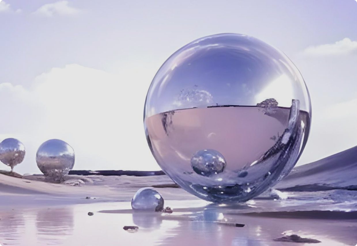
Trend 2: Iridescent Generative Gradients (AI-Driven Depth) The “Liquid Metal” aesthetic born from AI tools. Moving Slate + Aqua gradients create dimensional, living aesthetics that static design simply cannot replicate.
Trend 3: Neurodiverse Accessibility (Soft-UI) Cream backgrounds replace pure white. High-contrast Navy improves readability. Accessibility is now driving aesthetic innovation, not limiting it.
Trend 4: Split-Complementary Sophistication A base color paired with two colors adjacent to its complement. High contrast without jarring vibration. More considered, more premium.
Trend 5: Quiet Luxury Palettes Desaturated, rich tones — burgundy, pale gold, deep navy, warm taupe. Premium through restraint. This approach resonates strongly with high-intent buyers who have seen every loud trend come and go.
Winning brands treat color with the same strategic rigor as pricing, messaging, and positioning.
What’s Emerging in 2027: The Next Color Movements
Two significant shifts are taking shape for 2027. One pushes deeper into digital immersion. The other pulls deliberately back from it. Both are responses to the same force: the rapid normalization of AI-generated aesthetics.
Trend 6: Bioluminescent Depth (AI-Native Palette)
This goes beyond gradients. Colors that glow, pulse, or shift using CSS animations and generative AI tools create the sensation of being inside the digital world, not just looking at it. Deep ocean blues, electric teals, and phosphorescent greens define this direction. The palette signals cutting-edge capability and forward-thinking brand positioning. Built for AI products, deeptech platforms, and spatial computing brands entering the market.
Trend 7: Anti-Digital Warmth (Handcrafted Reaction)
The counter-movement to AI-polished perfection. Warm, slightly imperfect, tactile-feeling palettes: aged paper cream, terracotta, burnt sienna, dusty mauve. These colors feel deliberately human, handmade, pre-digital. They signal authenticity, craft, and trust at a moment when audiences are increasingly skeptical of anything that looks too generated. Artisan brands, boutique agencies, wellness businesses, and any brand that wants to look less like a template will find this direction highly effective.

7 High-Impact Palettes for Your Next Project
“Hacker-Luxe”: Jet Black + Fluorescent Green (#0A0A0A + #39FF14) — cybersecurity, dev tools, tech startups.
“Retro-Modernist”: Off-White + Rust Orange (#FAF9F6 + #B7410E) — D2C brands, editorial sites, creative agencies.
“DeFi Dawn”: Twilight Blue + Sunrise Orange (#2F3B62 + #F78E0E) — fintech, blockchain, innovation brands.
“Ethereal Tech”: Deep Purple + Bright Cyan (#4B0082 + #00FFFF) — gaming, blockchain, AI products.
“Quiet Luxury”: Burgundy + Pale Gold (#800020 + #ECD9B0) — premium services, luxury brands.
“Bioluminescent”: Dark Teal + Electric Phosphor + Deep Navy (#0D2137 + #00F5C4 + #001F3F) — AI products, deeptech, spatial computing, VR/AR brands. The vibe: like looking through deep ocean glass. Immersive, otherworldly, technically supreme.
“Artisan Warmth”: Aged Cream + Terracotta + Dusty Mauve (#F5F0E8 + #C4622D + #B5848A) — boutique agencies, artisan brands, wellness, personal services. The vibe: reassuringly human. Feels made by people who care, not generated by algorithm.
Implementation: The 60-30-10 Rule
However strong your palette is, the ratio matters as much as the colors themselves.
60% Primary (neutral/background): Sets the mood
30% Secondary (supporting): Builds brand identity
10% Accent (action): CTAs and conversion moments only
Your Palette Is a Message
Choose colors that signal where your brand stands, align with the creative movements defining this year, and create genuine emotional resonance with the people you are trying to reach.
At Bright Nation Studio, we build color strategies that do exactly that. If your current palette is not working hard enough for your brand, let’s change that. Talk to Bright Nation team.