

MIM BUSINESS SCHOOL



Project Story
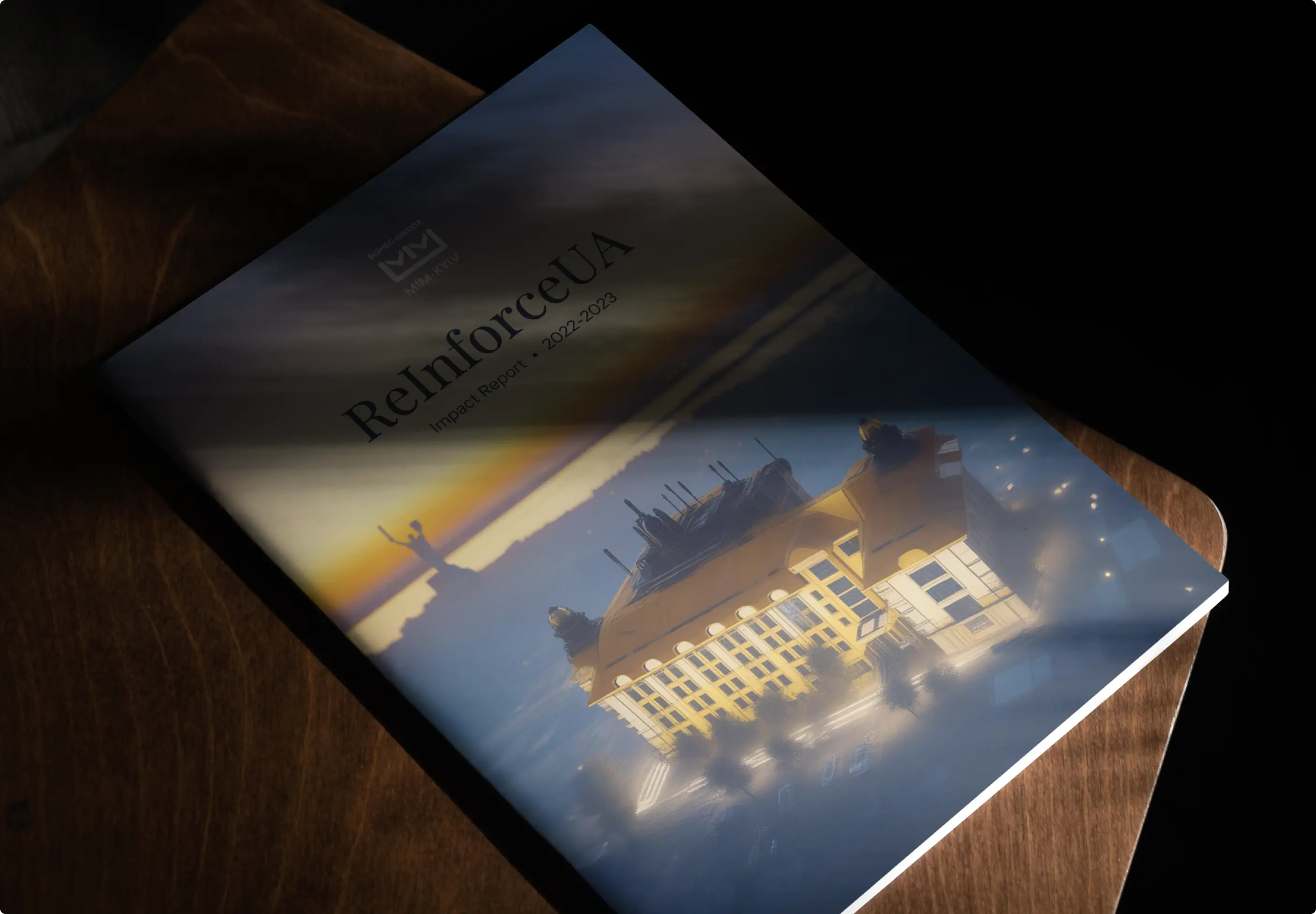
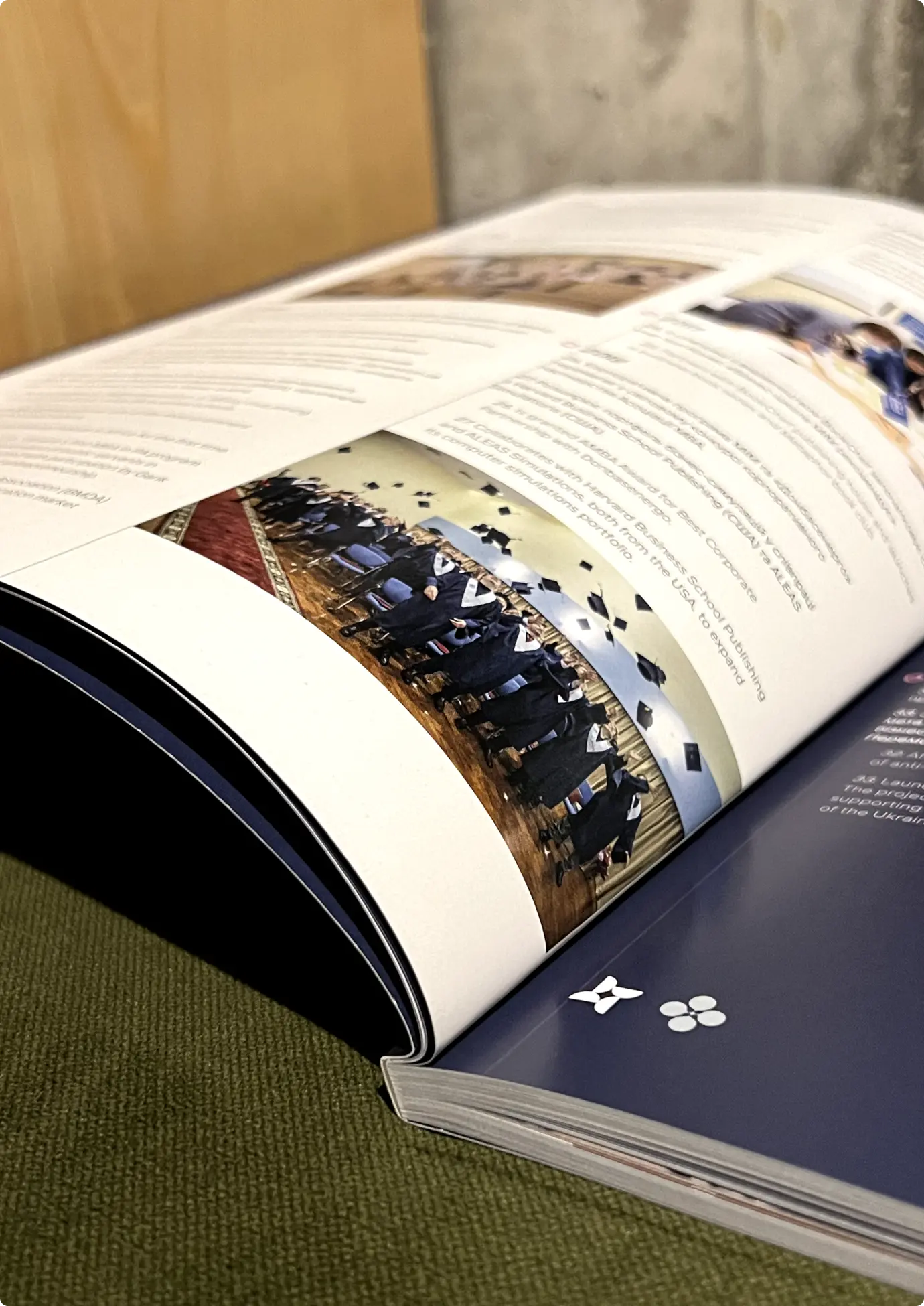
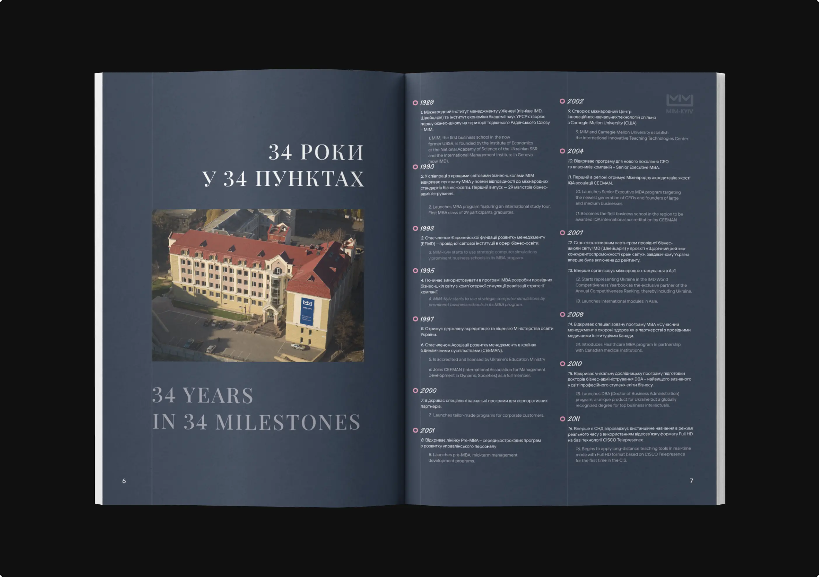
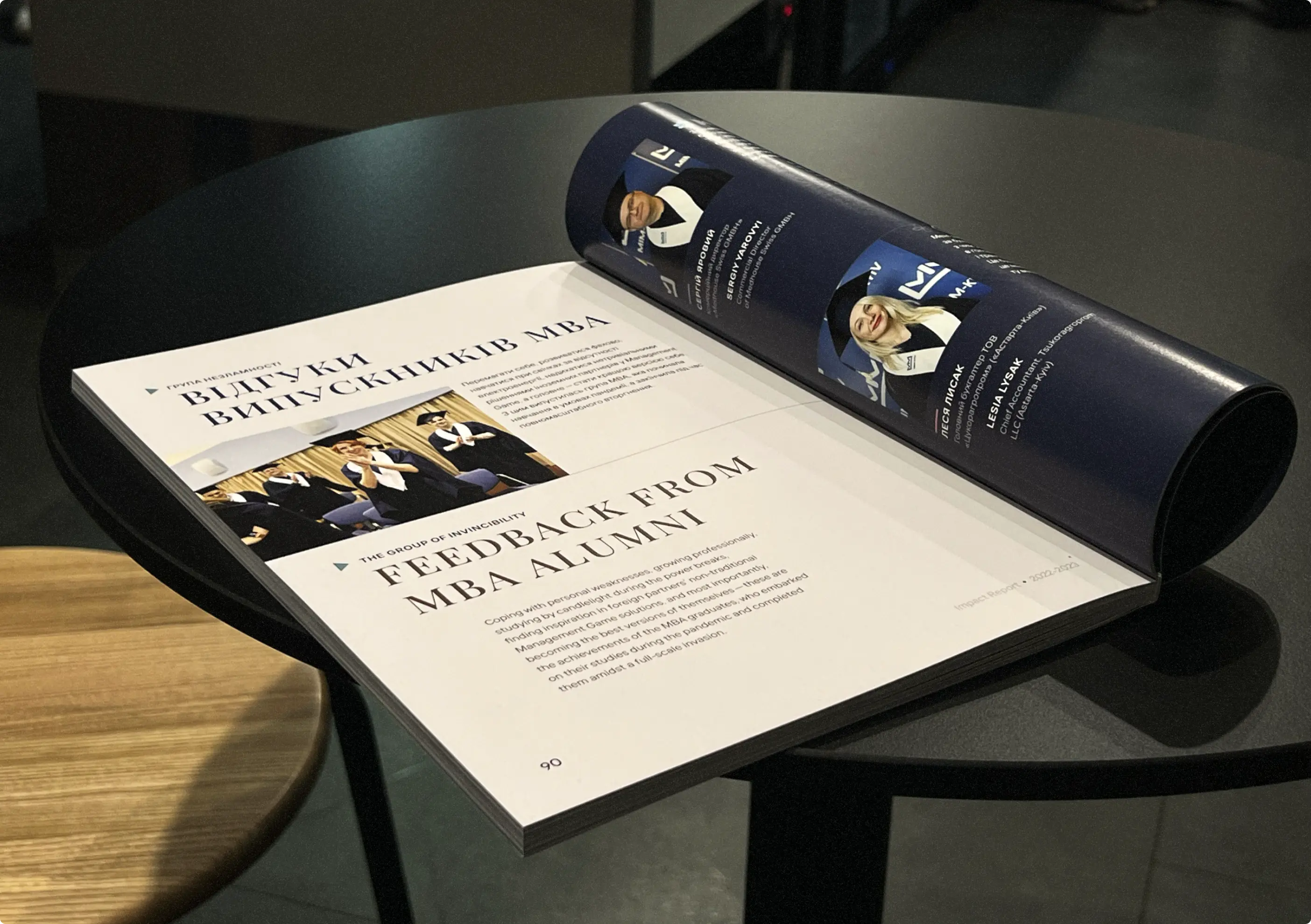
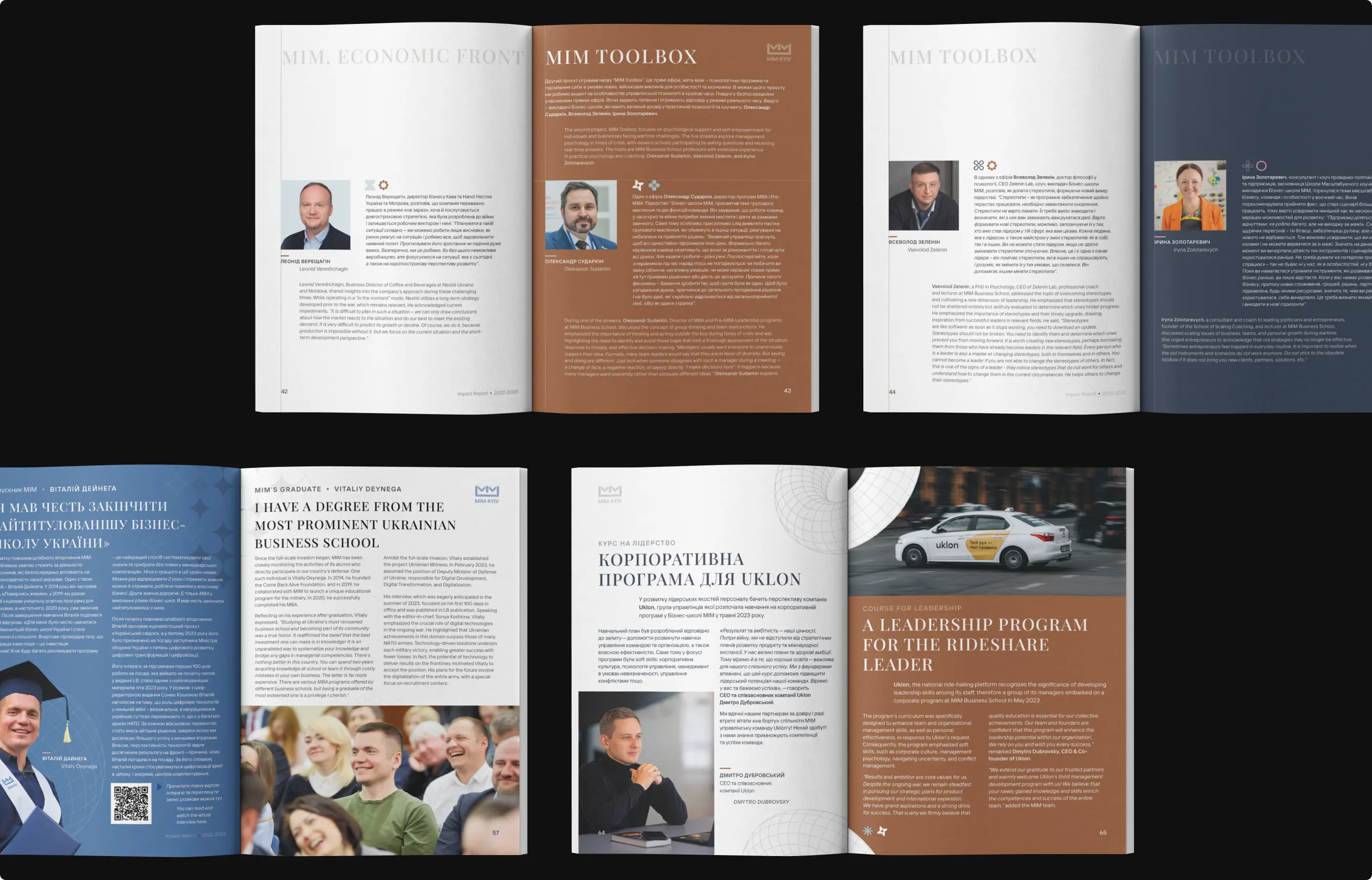
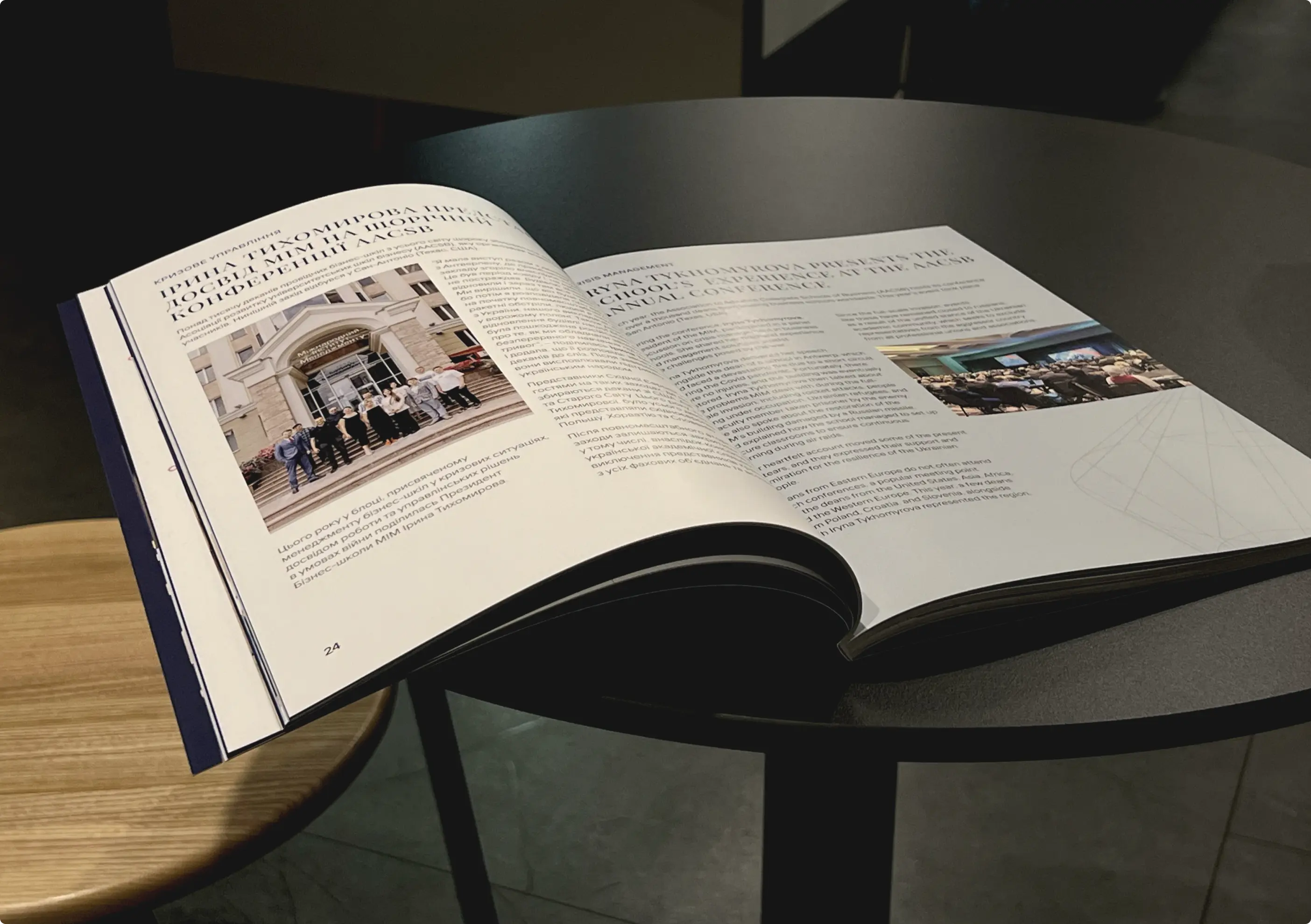
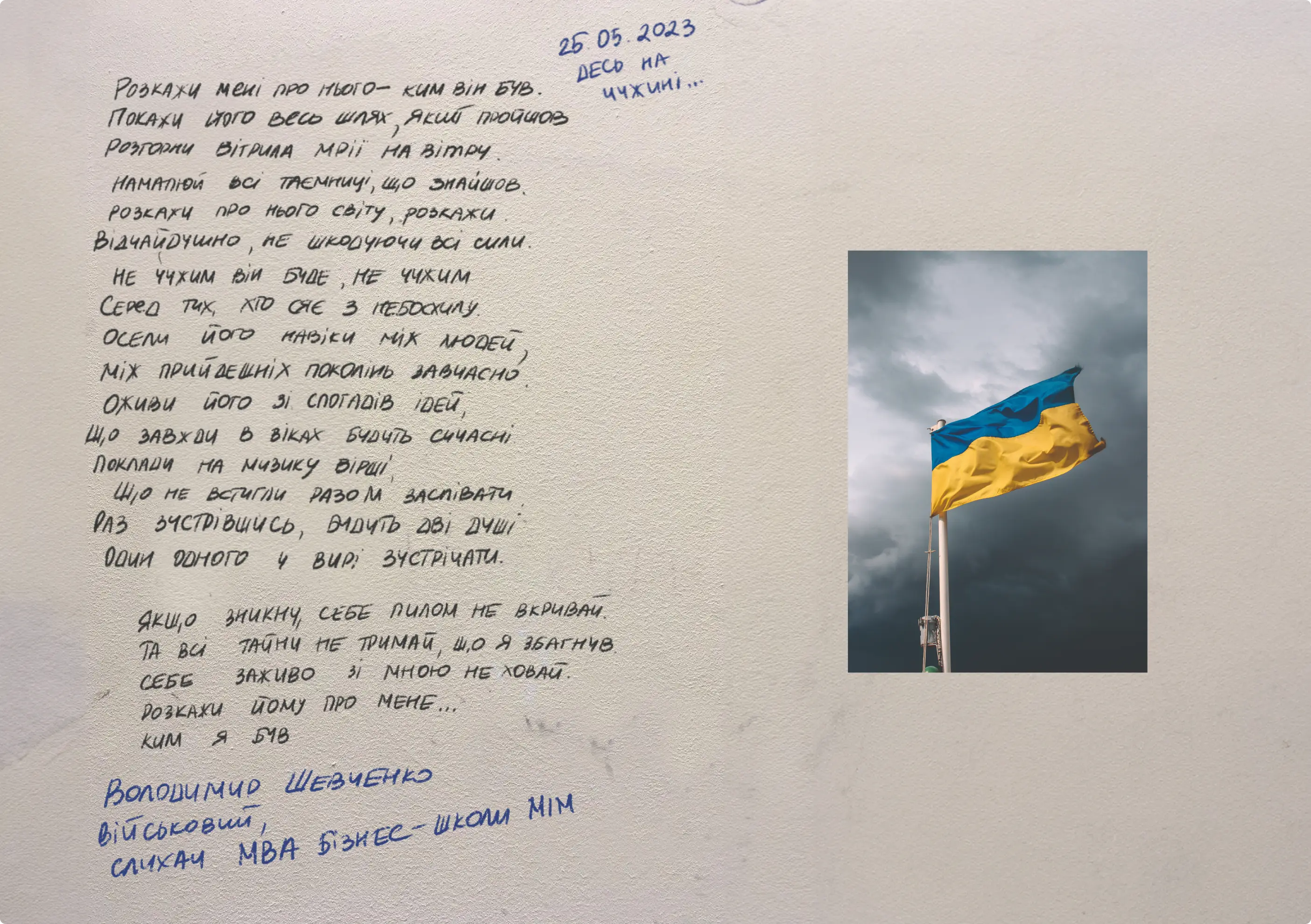
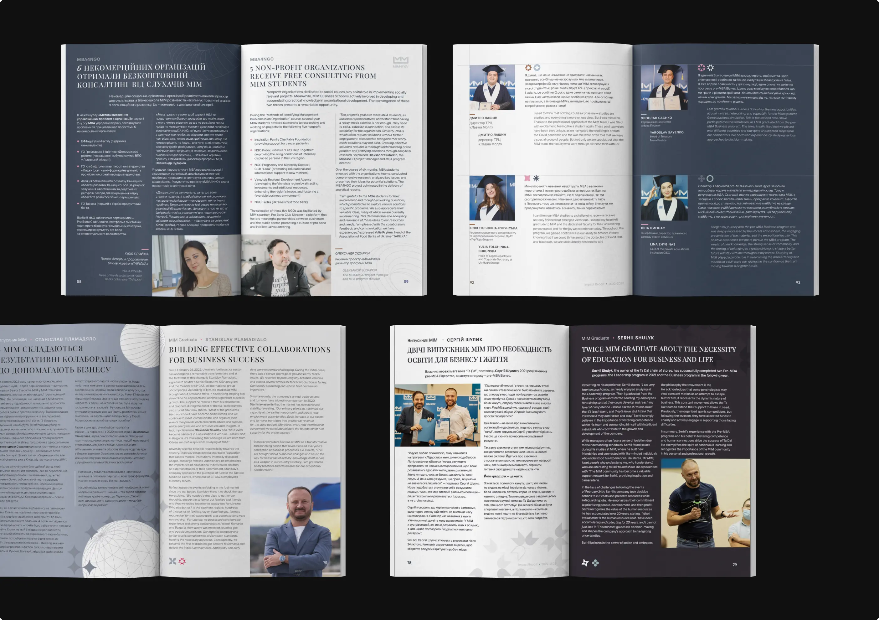
For MIM Business School, our team designed a large annual printed report that brought together the school’s achievements, programs, business initiatives, expert content, and key yearly highlights in one structured publication.
Our task was to make a content-heavy report feel professional, readable, and easy to navigate. We worked on the layout, typography, visual hierarchy, and print-ready design, creating a polished publication that supports MIM’s communication with students, partners, alumni, and the wider business community.

FAQs
a good strategy
Yes. Annual reports and large publications require more than nice layouts. They need a clear structure, strong typography, logical content flow, and careful preparation for print, so the final material feels professional, readable, and easy to navigate.
Yes. Institutions often need materials that communicate achievements, programs, initiatives, expert content, and community impact. We design reports that feel credible, organized, and aligned with the organization’s professional image.
Yes. Print-ready design includes correct layout setup, margins, typography, image quality, file preparation, and final checks before production. This helps avoid technical issues and ensures the printed version looks polished and professional.
Absolutely. Even serious reports can feel interesting when the design uses strong structure, thoughtful visuals, photography, infographics, pull quotes, and clear storytelling. The goal is to keep the material professional while making it easier and more pleasant to read. An annual report often represents the organization’s credibility, progress, and values. A polished design helps the brand look more professional, communicate achievements clearly, and create a stronger impression for partners, students, clients, investors, or the wider community.
Of course. For large publications, structure is a major part of the design work. We help arrange content into logical sections, improve flow between pages, and create layouts that support the message instead of simply placing text into a template. Without strong hierarchy, all content feels equally important and the reader gets tired quickly. Good hierarchy helps separate main ideas from details, highlight key messages, and make the publication easier to scan and understand.

