

POP MAISON
Project Story
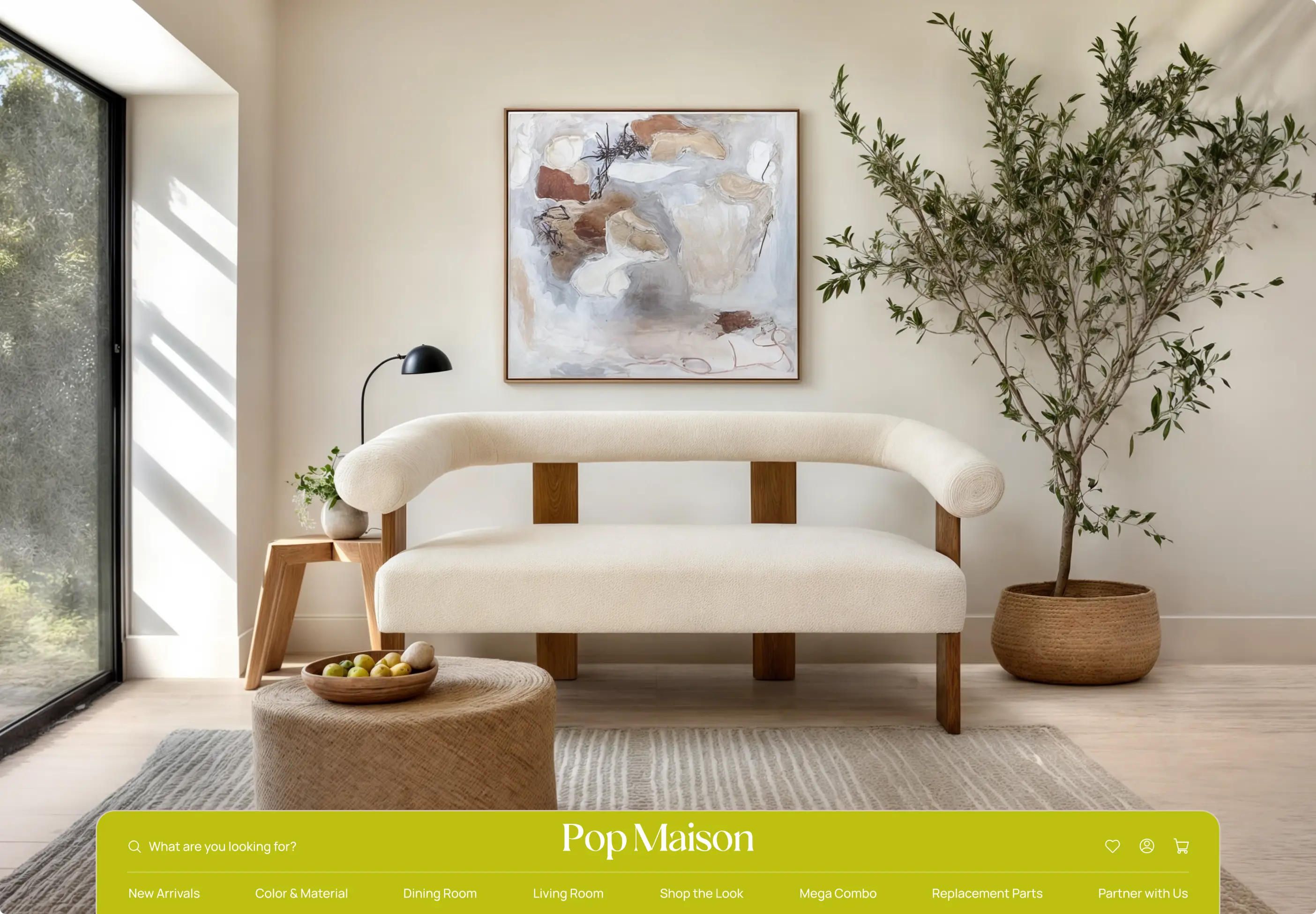
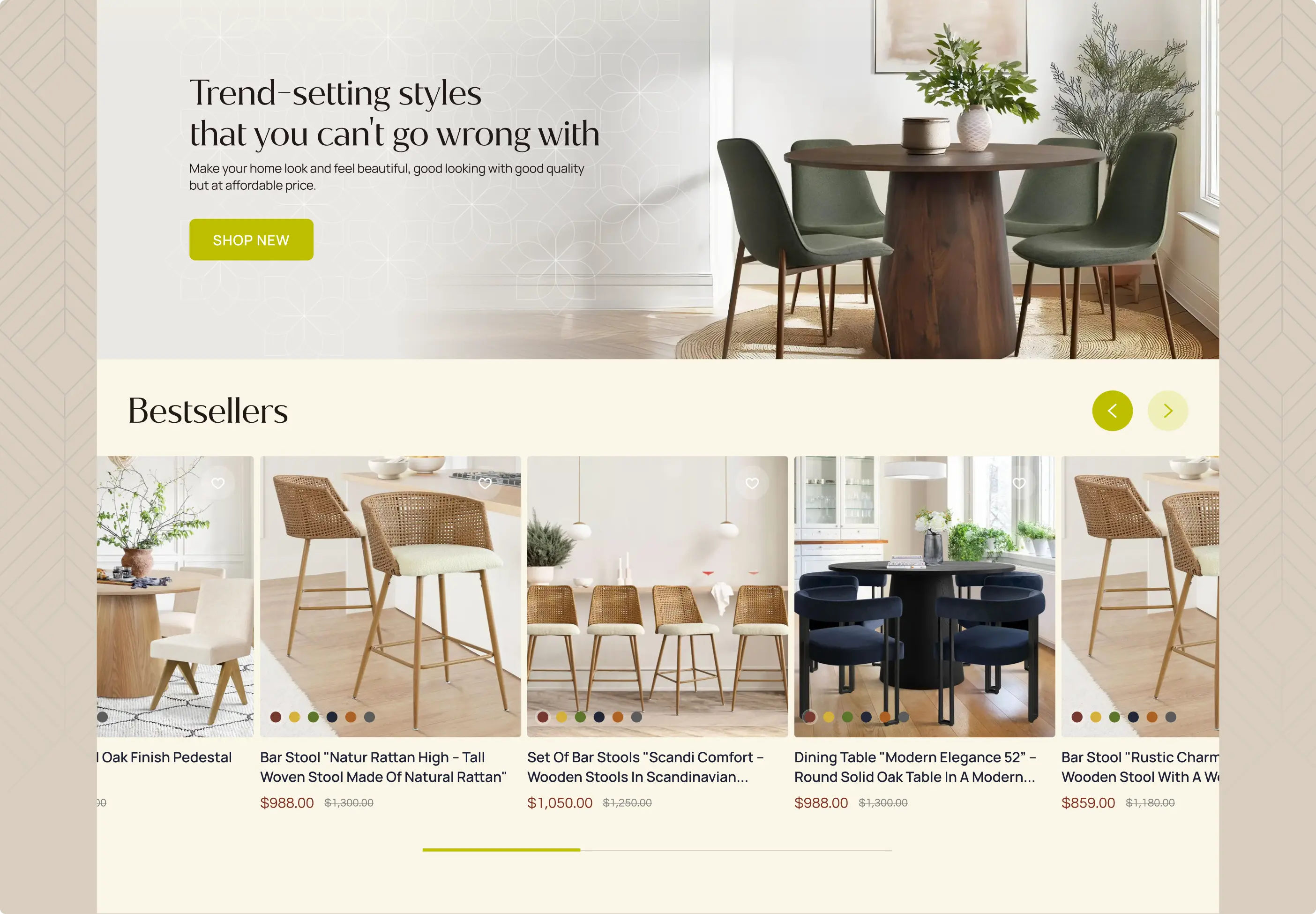
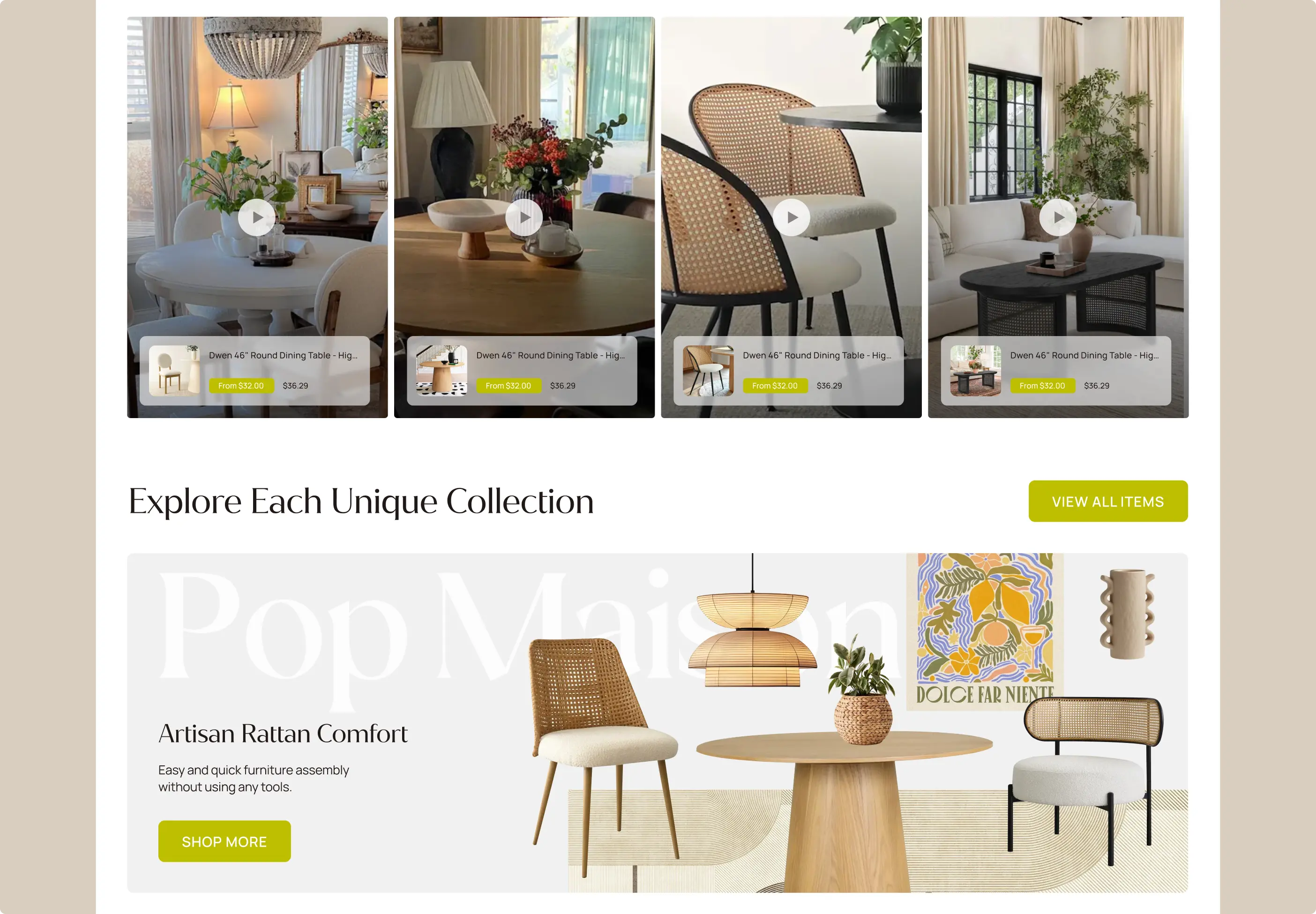
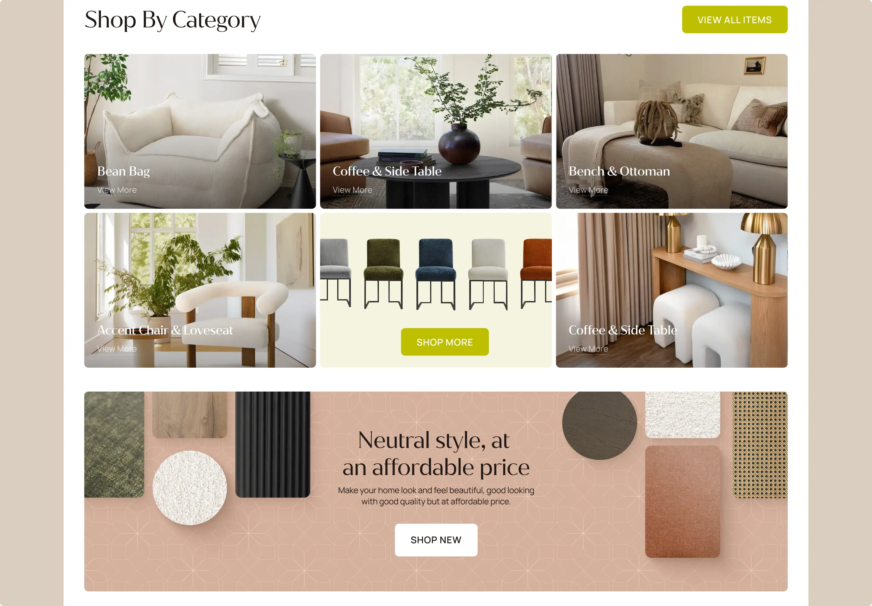
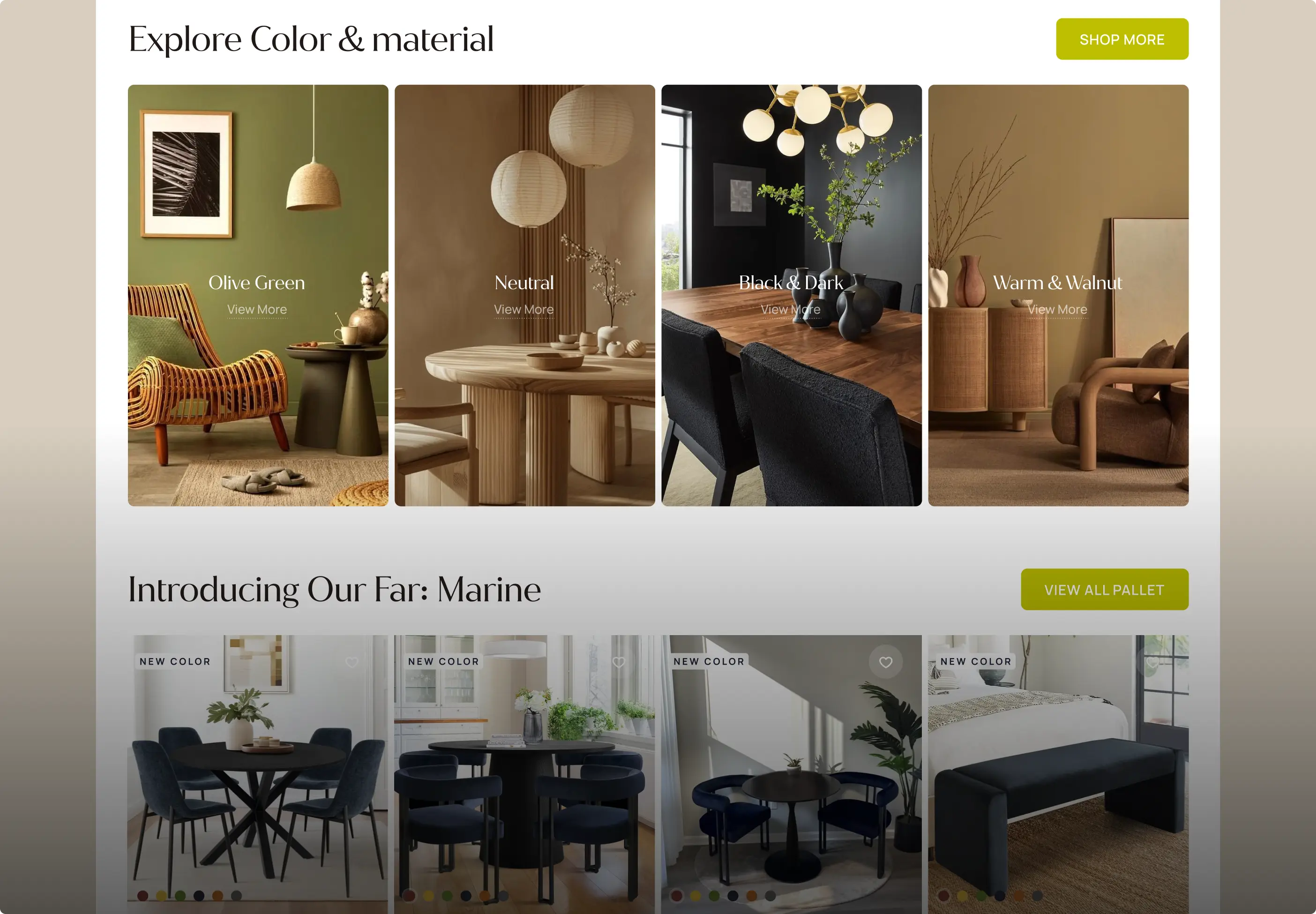
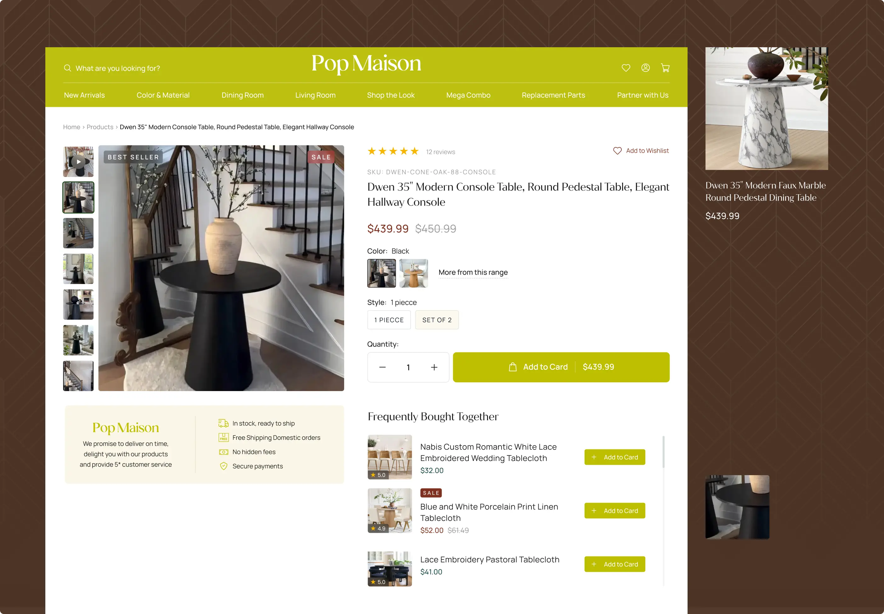
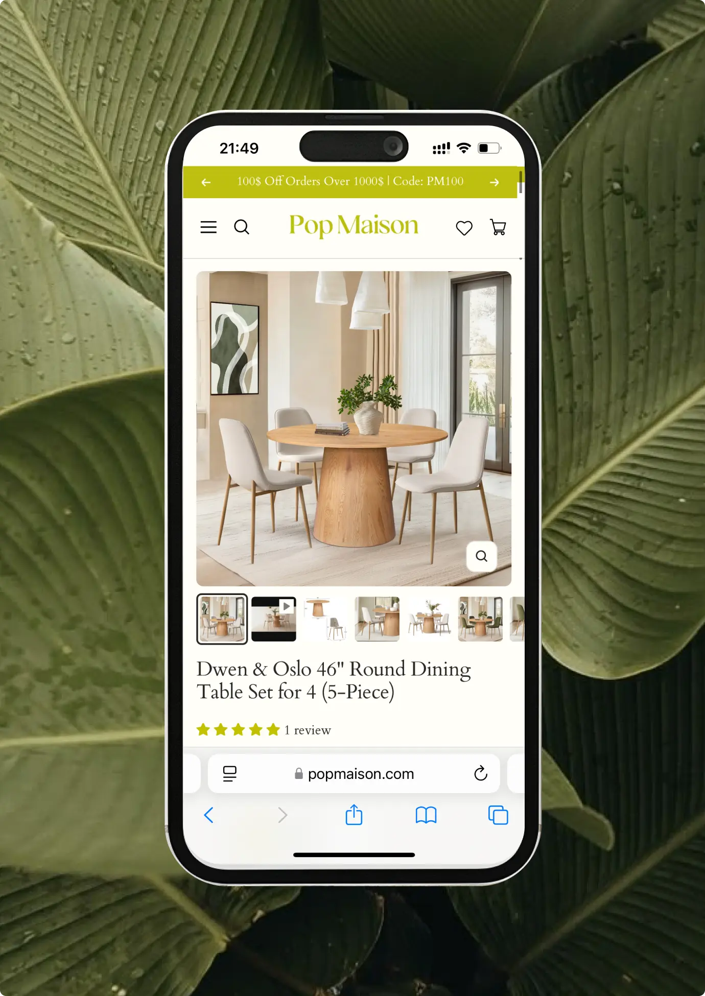
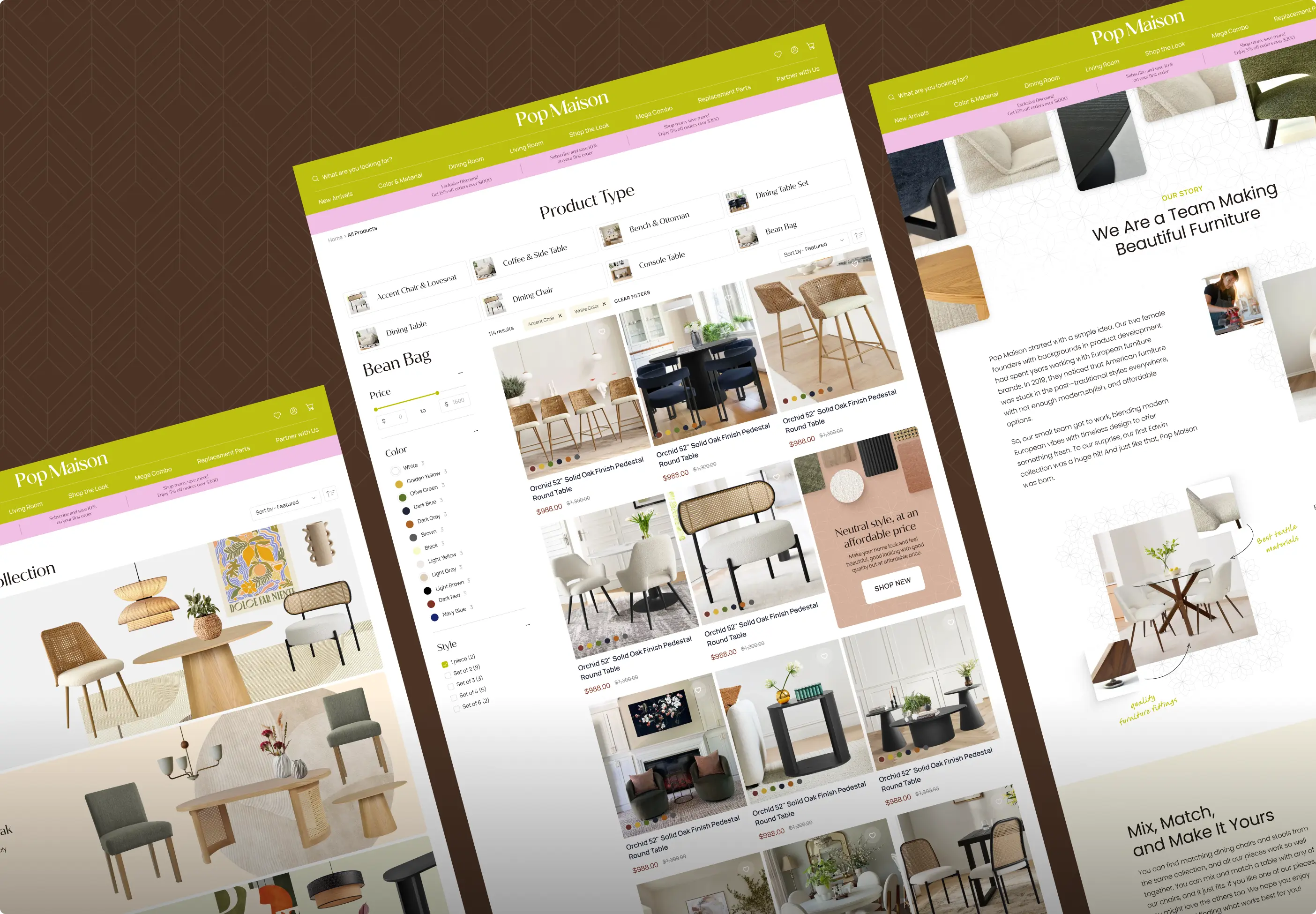
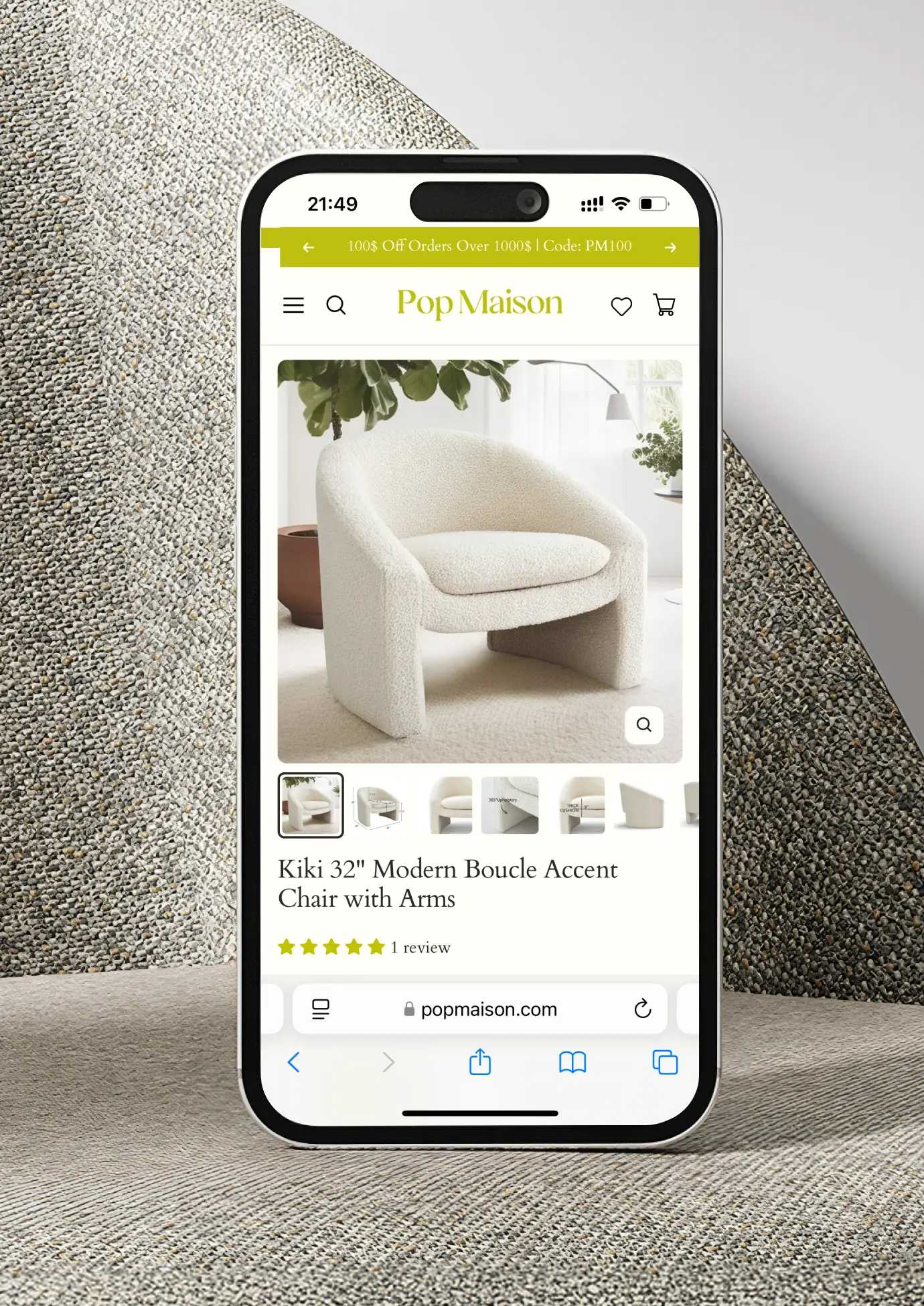
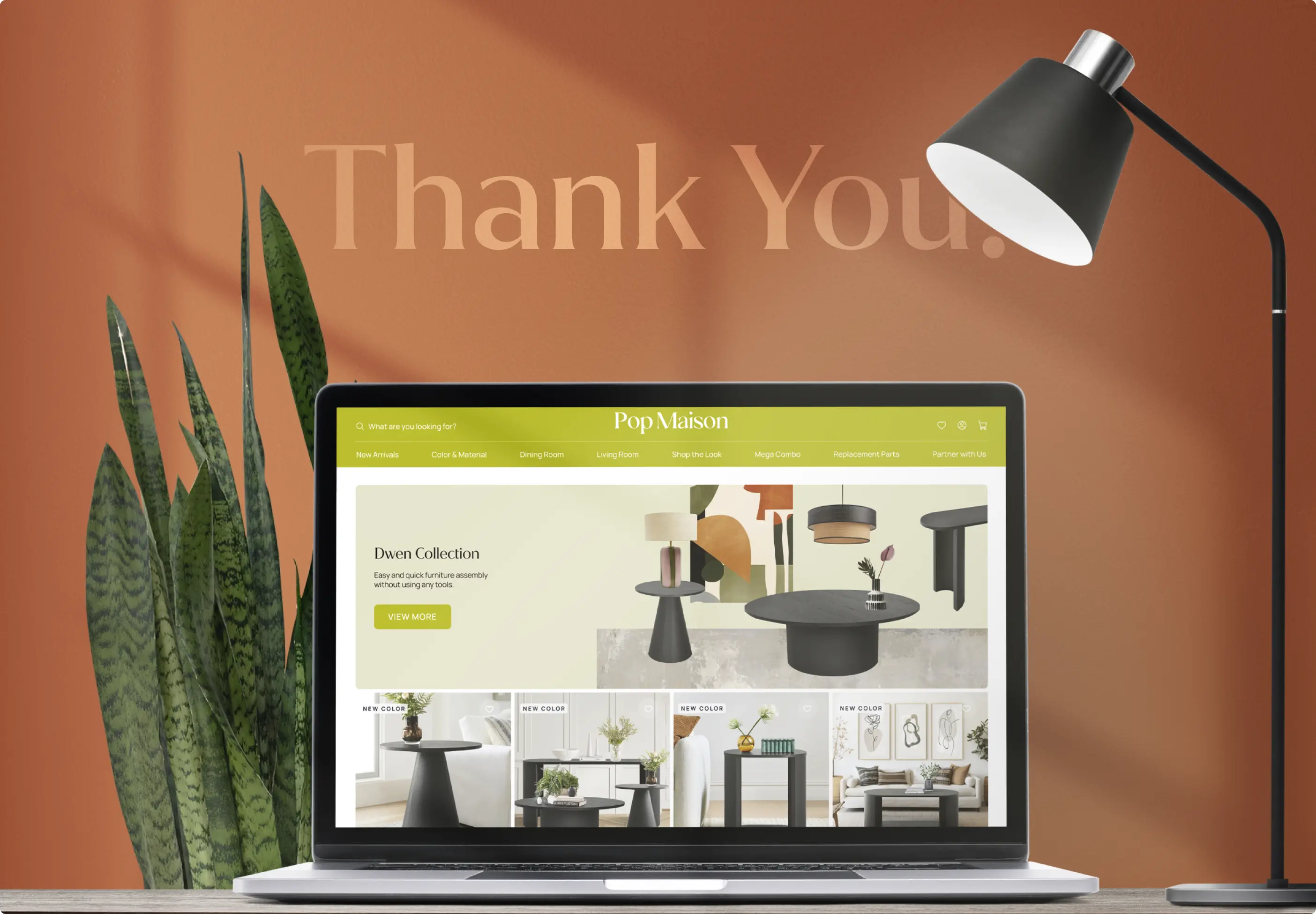
Pop Maison came to us with an already successful e-commerce website, but the existing design no longer matched the level of the brand. It felt outdated, overloaded, and too close to a standard template, so the project required a full redesign that would bring more character, freshness, and modern visual quality to the online experience.
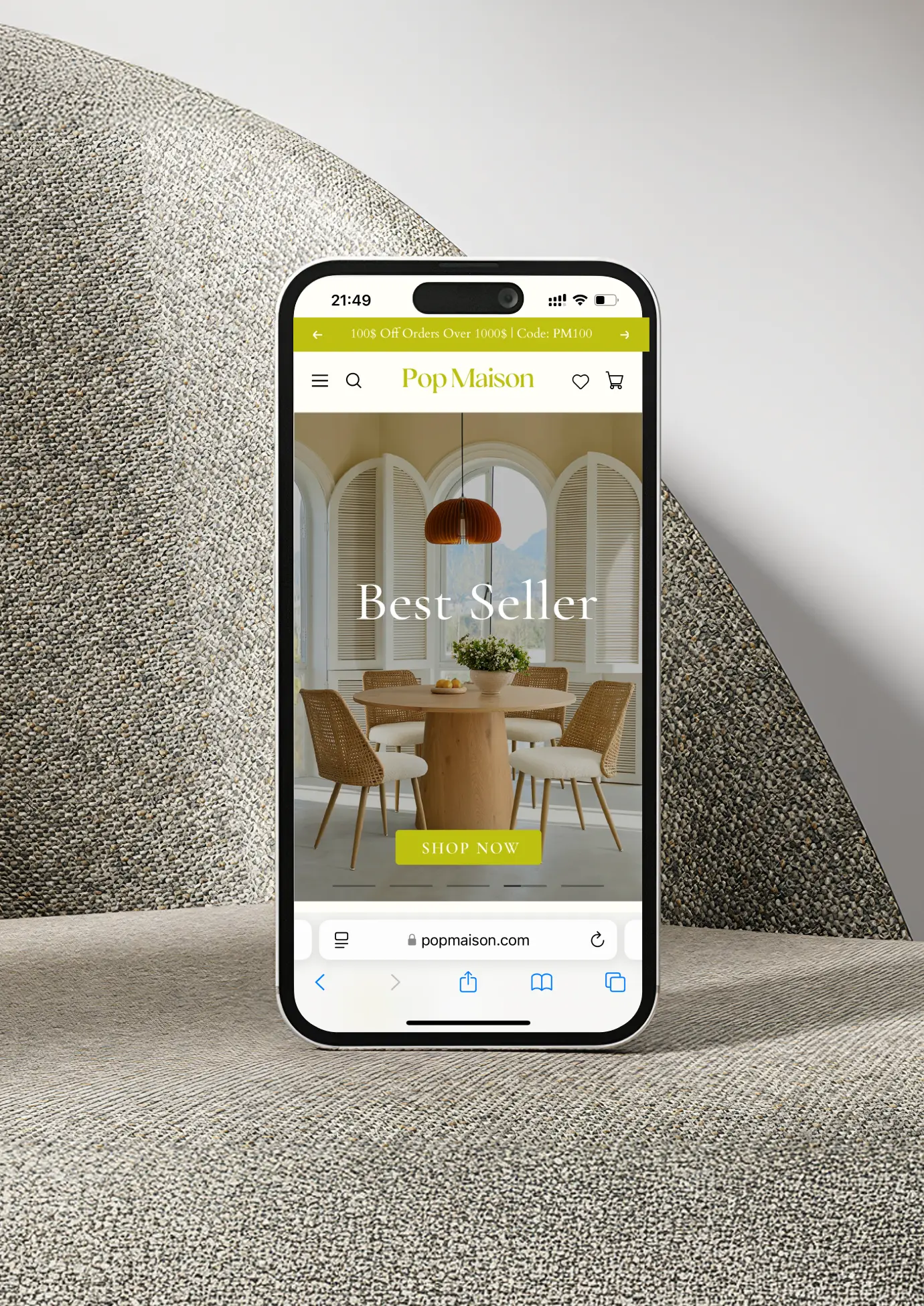
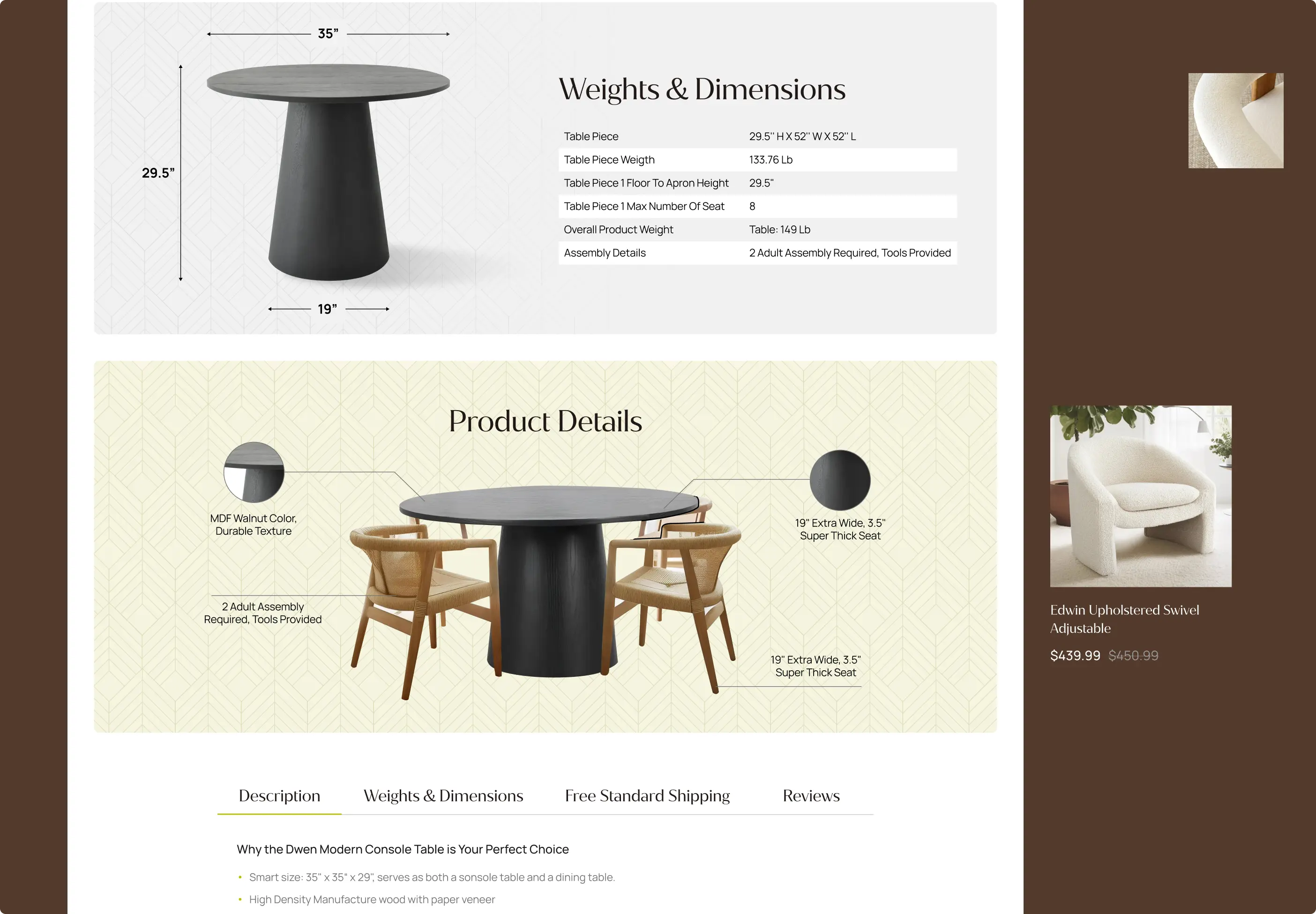
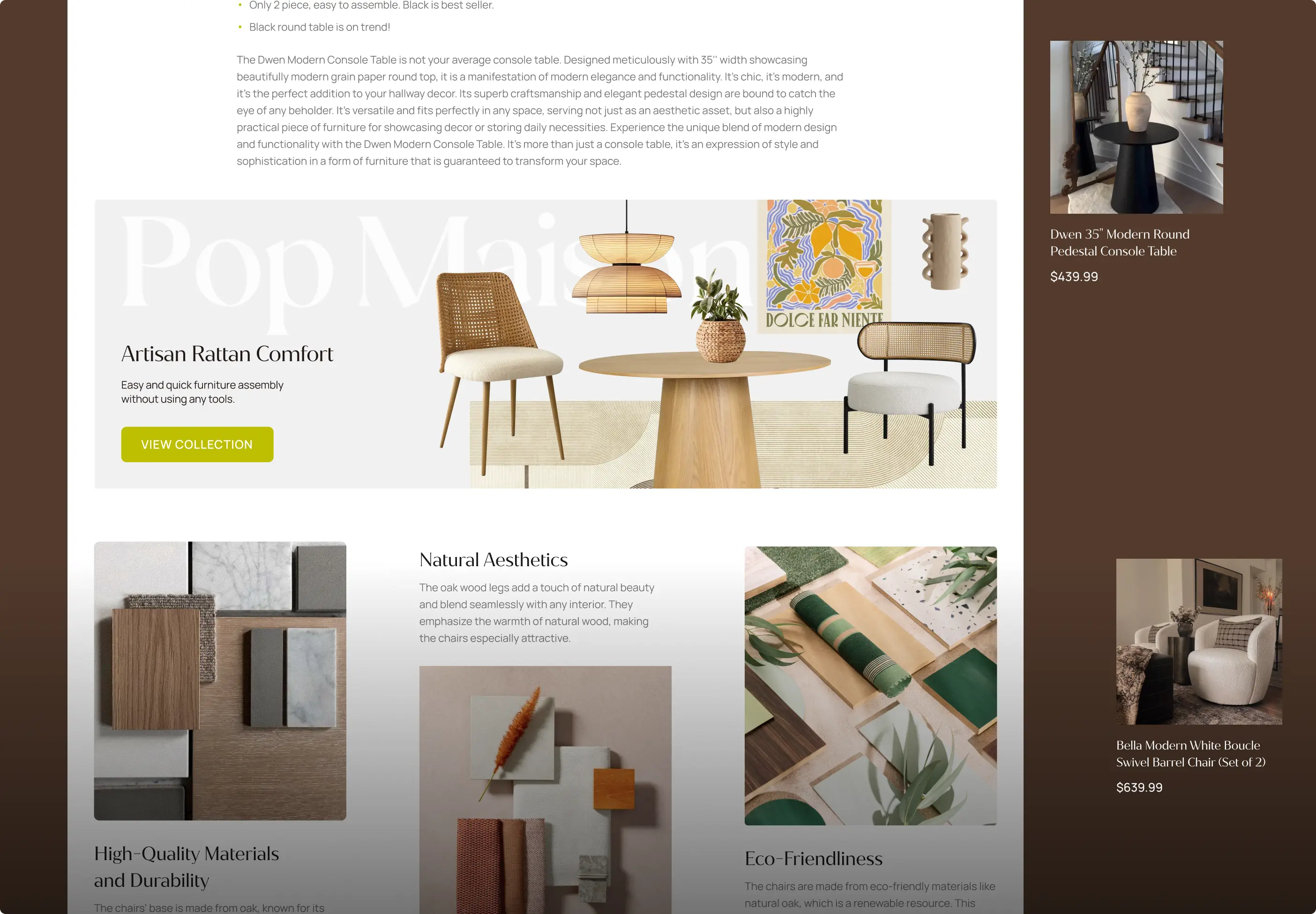
We redesigned the website with a cleaner structure, improved navigation, stronger visual hierarchy, and a more polished modern style. By removing unnecessary clutter and rethinking the overall flow, we helped make the shopping experience easier, more pleasant, and more aligned with the brand’s popularity and growing customer expectations.

FAQs
a good strategy
We look at the existing structure, user behavior, and brand strengths before changing the design. The goal is not to redesign everything just for the sake of change, but to improve the parts that feel outdated, overloaded, or unclear while keeping the foundation that already supports the business.
The website should look modern and inspiring, but it also needs clear product presentation, readable content, simple category logic, and a smooth path to purchase.
Absolutely. Many online stores start to look generic when they rely too much on standard layouts or visual patterns. For Pop Maison, we created a fresher and more distinctive visual direction, added stronger accents, improved hierarchy, and made the website feel more connected to the brand rather than just another standard store.
Sometimes a brand already has traffic, customers, and recognition, but the website no longer reflects its current level. For Pop Maison, the goal was to refresh an already active e-commerce website and make it feel more modern, polished, and aligned with customer expectations.
Definitely. When a website looks outdated or too busy, customers may feel that the brand is less professional than it really is. A thoughtful redesign can make the business look more current, trustworthy, and confident, while better matching the quality and popularity the brand has already achieved.
Too much visual noise can make it harder for users to focus, browse, and make decisions. By simplifying the structure and improving visual hierarchy, the website becomes easier to understand and more pleasant to use. This helps customers move through the shopping journey with less friction.
Yes, and this is often the best approach for established brands. A good redesign does not have to erase the existing brand. It can keep what customers already recognize while making the website feel cleaner, fresher, and more relevant. For Pop Maison, the goal was to modernize the experience and add more character without losing the brand’s existing customer connection.

