WELLBUB


Project Story
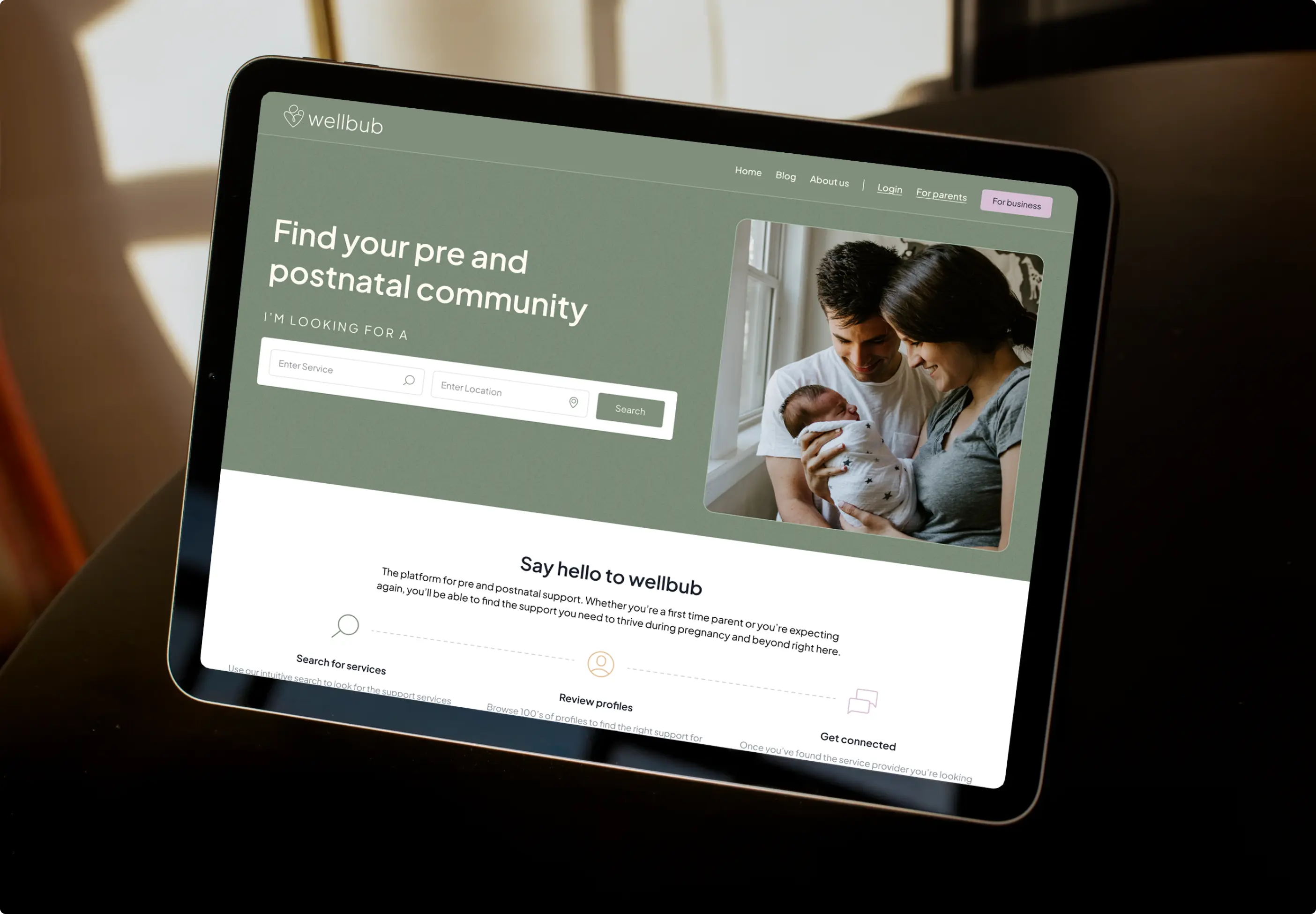
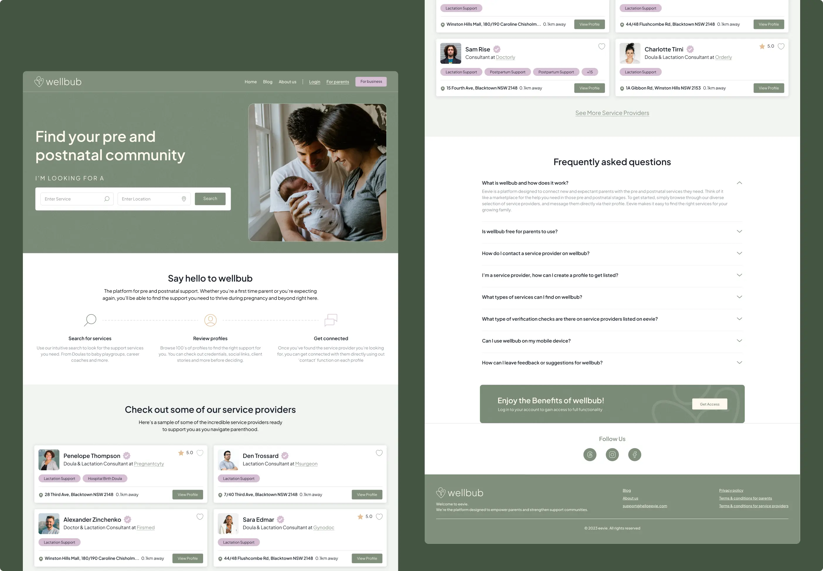
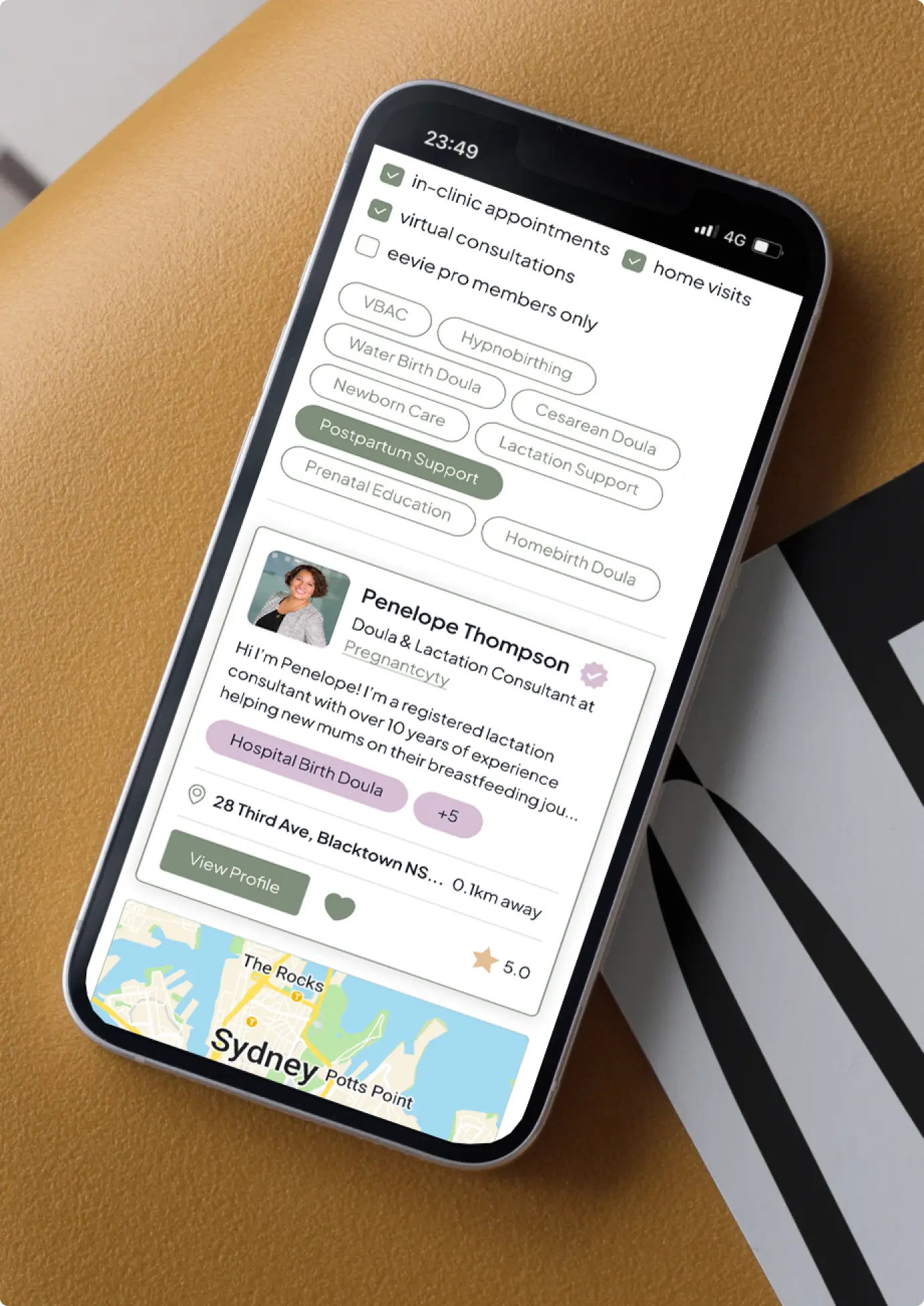
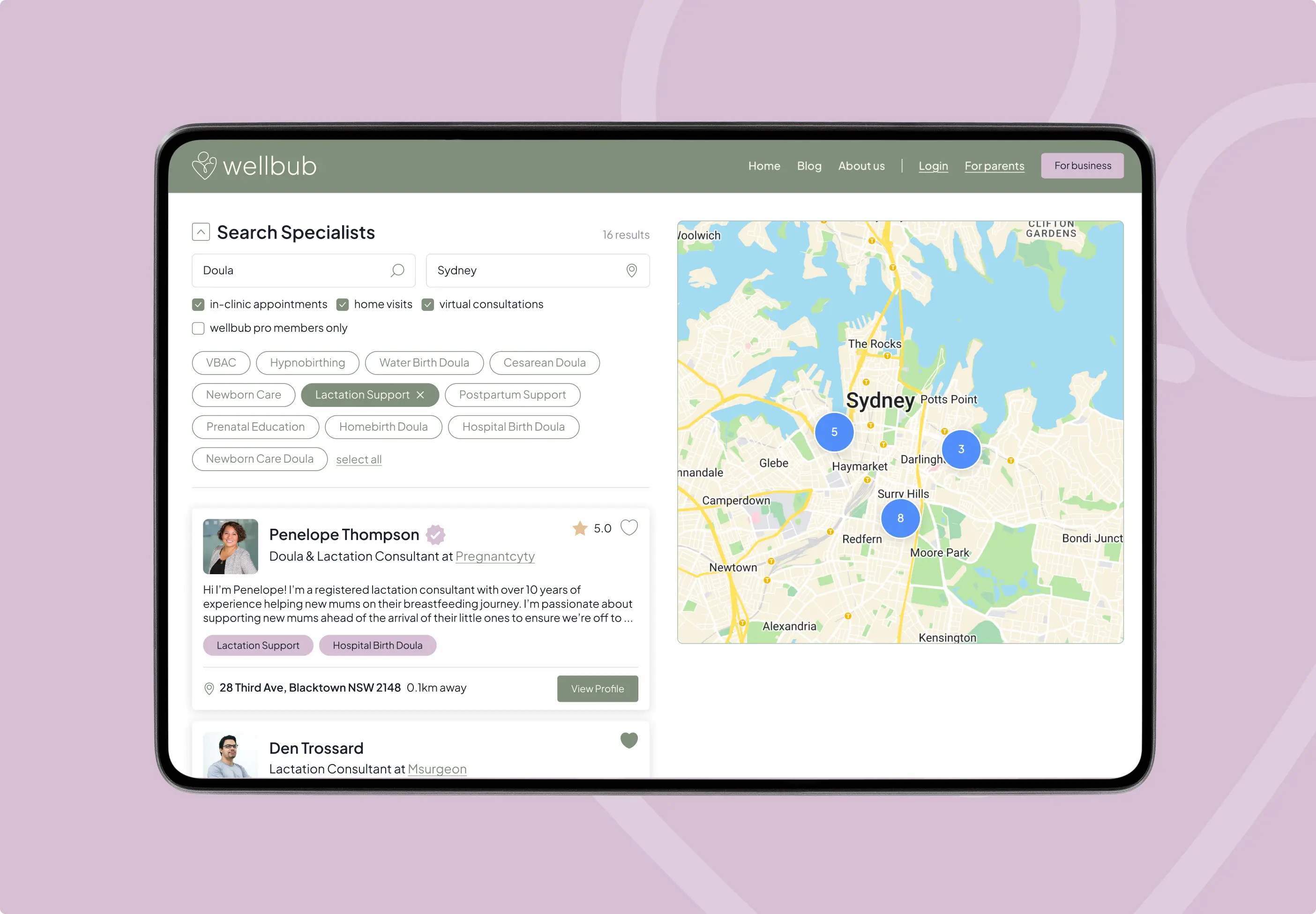
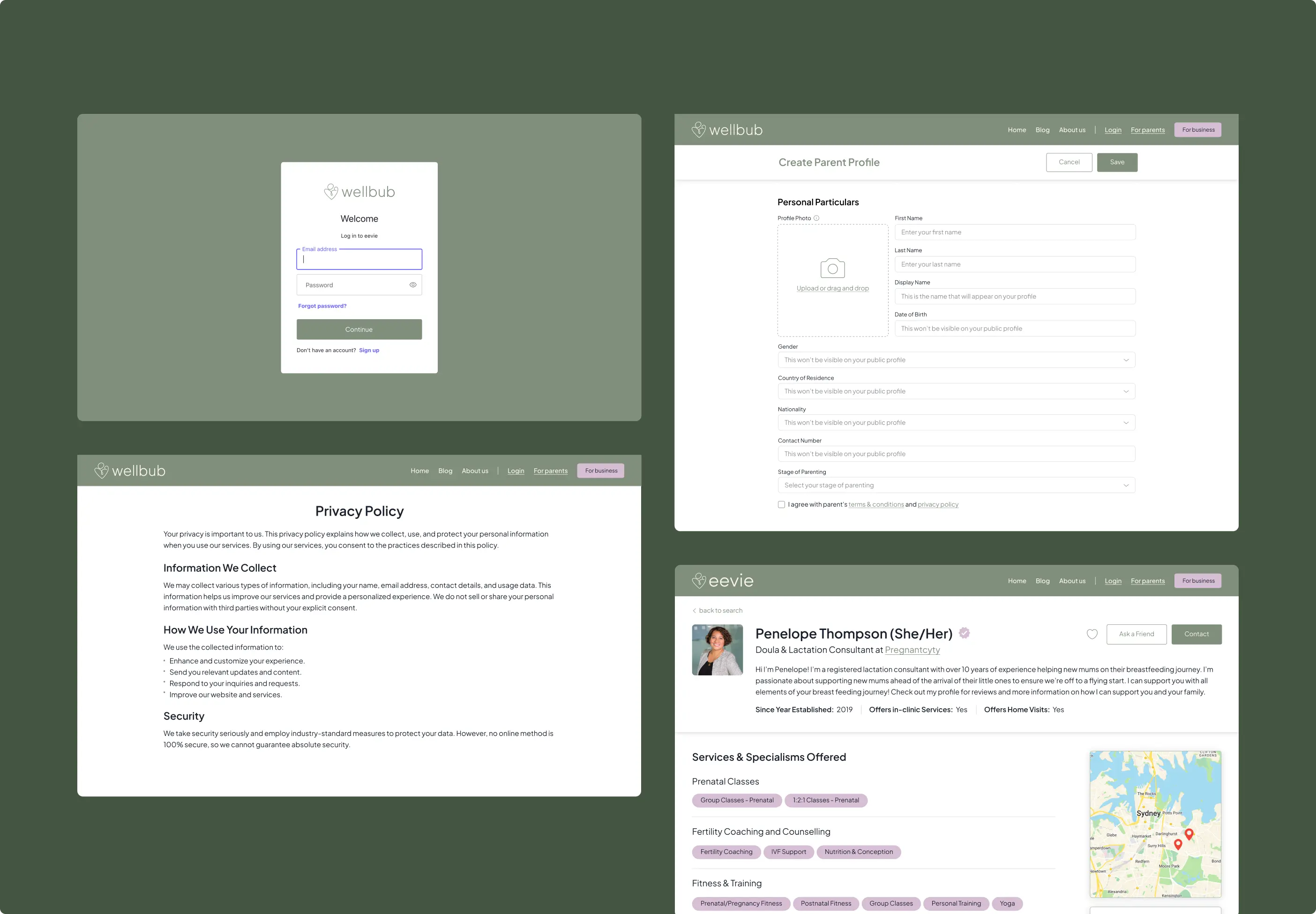
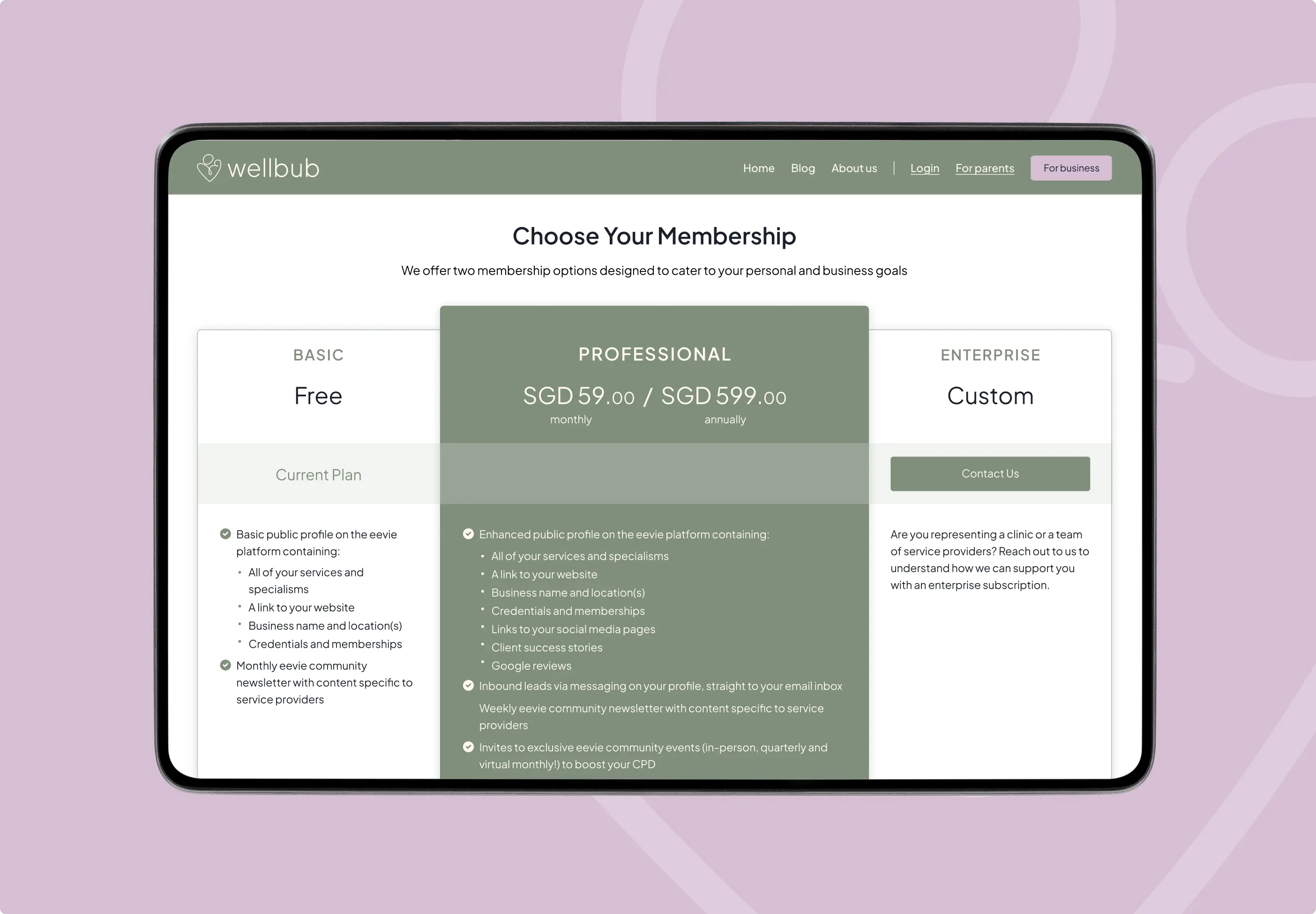
For Wellbub, our team created the branding and UI/UX design for a pregnancy-focused digital platform built around support, comfort, and intuitive use. The project had a complex structure with multiple filters, user paths, and platform features, so the interface needed to feel calm and easy to navigate across both desktop and mobile.
We developed a strong visual identity, responsive layouts, intuitive navigation, and clear filtering logic to help users find relevant information and options more easily. The goal was to make a sensitive and content-rich platform feel organized, reassuring, and comfortable for people navigating pregnancy-related needs.

FAQs
a good strategy
Yes. Wellness platforms often need to combine content, services, products, filters, user preferences, and different browsing paths in one experience. We design the structure so the platform feels calm and easy to navigate, even when the functionality behind it is complex.
We reduce visual noise, organize information into clear steps, and create an interface that feels calm from the first screen. For wellness-related products, the user should not feel pressured or lost — the experience needs to guide them gently toward the right information or option.
Yes. Filters should simplify the decision-making process, not make users think harder. We design filtering logic around real user needs, so people can narrow down options by relevant criteria and find what fits them faster.
We design with extra attention to tone, clarity, and emotional comfort. This means soft visual direction, readable content, simple interactions, and a user journey that feels respectful, reassuring, and easy to control.
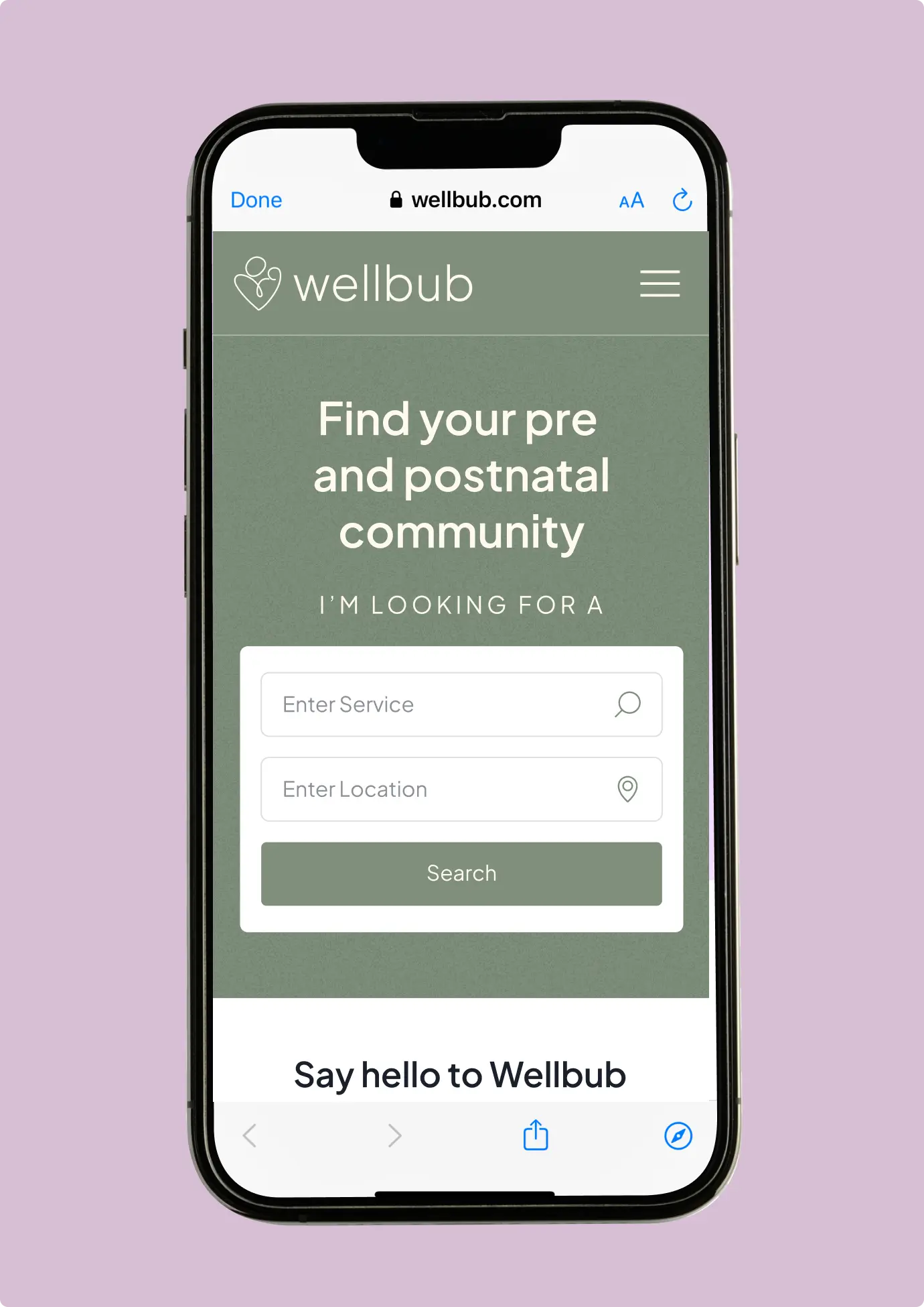
We prioritize the most important actions and adapt complex functionality into a mobile-friendly flow. Navigation, filters, cards, forms, and content blocks need to stay easy to use without feeling compressed or overloaded on a smaller screen.