

Brand Architecture Models and Brand Aesthetic Design in 2026


Most brands invest in aesthetics without addressing architecture, or define structure without building a scalable visual system. Both decisions are expensive. The core argument is simple: structure prevents confusion, and systematic aesthetics enable growth. Get both right and you build brand equity that compounds over time.
Structure + Style = Brand Equity
A brand is not a logo. It is an ecosystem with two interdependent layers: a structural layer that defines how your brands relate to each other, and a sensory layer that defines how they look, feel, and communicate.
Get the structure wrong and customers get confused. Get the aesthetics wrong and customers lose trust. Get both right and you build something that compounds: measurable brand equity.
Apple’s brand equity sits at $1.3 trillion, up 28% year over year. That number is not the result of good design alone. It reflects decades of disciplined architectural decisions paired with a scalable, instantly recognizable aesthetic system. The two work together.
This article covers the four brand architecture models you need to understand, a six-step system for building your brand aesthetic, and the three trends reshaping how leading brands design and scale their visual identity.
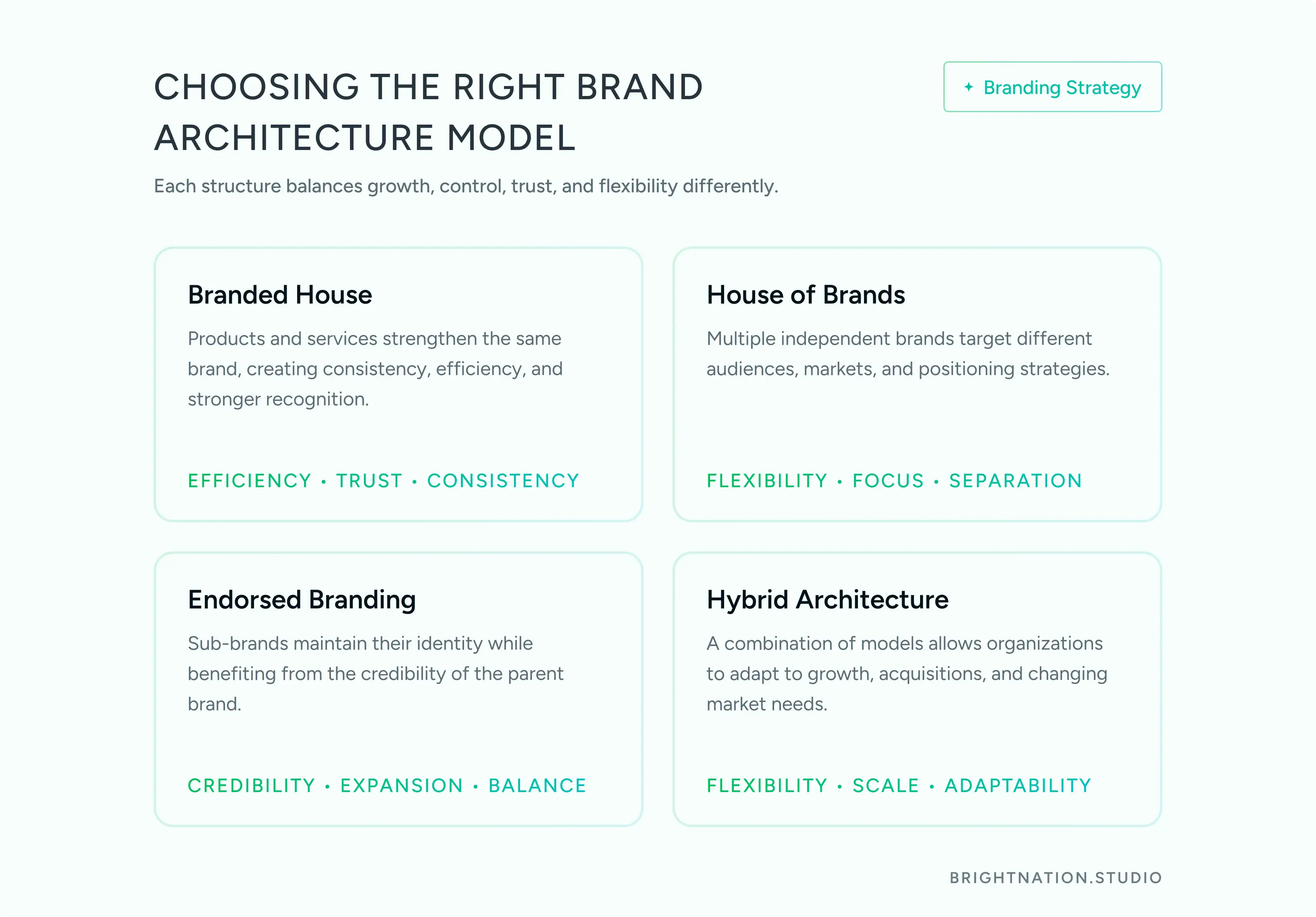
The 4 Brand Architecture Models: Choose Your Blueprint
Brand architecture is a strategic decision, not a creative one. It determines how marketing investment flows, how risk is distributed, and how customer loyalty transfers across your portfolio.
Model 1: Branded House (One Master Brand)
A single master brand powers every product and sub-offering. iPhone, MacBook, AirPods, Apple Watch: they all carry the same name, the same equity, the same trust. Google and Tesla operate the same way.
Pros: Marketing efficiency is high. Loyalty earned by one product transfers to every other. Costs stay low because you are building one brand, not many.
Cons: Concentration risk is real. One product failure or PR crisis touches the entire brand. Apple’s $1.3 trillion equity is also $1.3 trillion of exposure.
Best for: Companies with cohesive product lines and a strong, well-established core brand identity.
Model 2: House of Brands (Independent Brands)
Each brand operates as its own entity with its own identity, voice, and audience. P&G runs Tide, Gillette, and Pampers as separate brands. Unilever does the same with Dove, Axe, and Ben & Jerry’s.
Pros: Precise audience targeting. No cross-contamination of risk. If one brand stumbles, the others are insulated.
Cons: Higher management costs. No loyalty transfers between brands. You are building multiple brand equities simultaneously.
P&G generates $84 billion in annual revenue with a $400 billion market cap using this model. The investment required to maintain it is substantial, but the portfolio diversification justifies it at scale.
Best for: Companies with diverse product portfolios targeting meaningfully different audiences.

Let’s get started! Contact us today to discover how we can help.
Model 3: Endorsed Branding (Parent + Sub-brands)
Sub-brands operate with their own identity but carry visible endorsement from the parent. Courtyard by Marriott. Virgin Atlantic. Virgin Mobile. The sub-brand gets independence; the parent provides credibility.
Pros: Balances autonomy with trust transfer. New ventures benefit from the parent’s established reputation without being fully absorbed by it.
Virgin Group manages over 200 companies worldwide using this model. The Virgin name opens doors; each sub-brand builds its own relationship with its market.
Best for: Companies expanding into new categories where the parent brand provides a credibility advantage but the new category requires its own positioning.
Model 4: Hybrid Architecture
Some portfolios are too complex for a single model. Amazon runs Amazon Prime under the master brand while operating Whole Foods with significant independence. Disney holds Disney+ under its core brand while giving Pixar and Marvel room to breathe as distinct creative identities.
Pros: Maximum flexibility. Different brands within the same portfolio can use different relationship models based on strategic need.
Best for: Large, acquisitive businesses with portfolios that serve genuinely different markets and require different brand relationships.
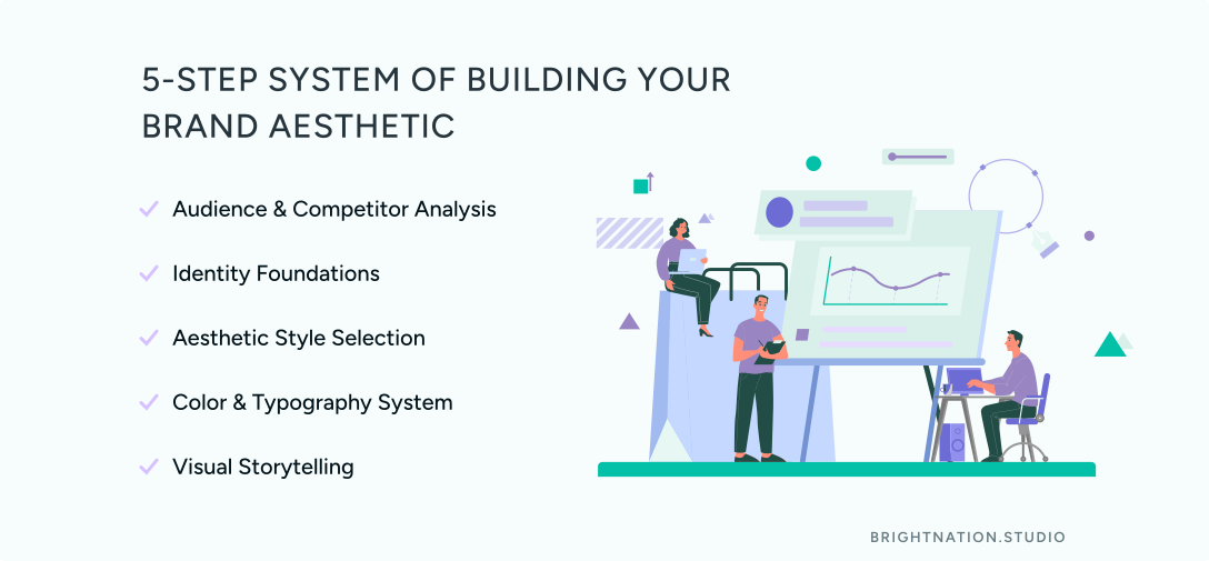
Building Your Brand Aesthetic: The 5-Step System
Once your architecture is defined, the aesthetic system gives it sensory form. This is not a creative exercise. It is a systematic process that translates business strategy into visual language.
Step 1: Audience and Competitor Analysis
Start with data. Which visual styles resonate with your specific demographic? What do competitors own visually, and where is the white space? Your aesthetic should be differentiated by design, not by accident.
Step 2: Identity Foundations
Your mission and values dictate your visual direction before any design decisions are made. Brands built on trust tend toward serif typography and muted, grounded tones. Brands positioning around innovation gravitate toward bold, geometric forms and high-contrast palettes. The visual system should be a direct expression of what the company actually stands for.
Step 3: Choose Your Aesthetic Style
Four dominant aesthetic archetypes define the current brand landscape:
Minimalist: Apple, Aesop. Clean space, deliberate restraint, premium positioning. Every element earns its place.
Retro: Polaroid, Dr. Martens. Nostalgia as a trust signal. Authenticity over polish.
Bold: Oatly, Skittles. Vibrant, disruptive, unapologetically playful. Designed to stop the scroll.
Luxury: Tiffany and Co., Rolex. Elegant, exclusive, timeless. The aesthetic communicates scarcity before the price tag does.
Your style choice should be grounded in Steps 1 and 2, not personal preference.
Step 4: Color Palette and Typography
Define primary, accent, and neutral colors with specific hex codes. A brand that looks beautiful in a campaign but inconsistent inside its product is not a coherent brand.
Establish a clear typographic hierarchy: headline font, body font, and the size and weight relationships between them. Typography carries tone.
Step 5: Storytelling Through Visuals
Define your imagery style, photography direction, and icon system. Are your photographs editorial or lifestyle? Warm or cool? Do your icons use rounded corners or sharp geometry?
These decisions are not decorative. They are the visual grammar your brand speaks in every touchpoint.
Clear architecture prevents customer confusion. Systematic aesthetics enable scale without losing identity.
Brand Aesthetic Trends Shaping the Current Landscape
Trend 1: Product-Led Perception
Brand experience no longer lives primarily in marketing. It lives inside the product. Onboarding flows, micro-interactions, empty states, and error messages are now primary branding touchpoints. Stripe’s payment flows and Notion’s onboarding are recognized as brand expressions in the same way a billboard once was.
Consistency in small moments signals reliability more effectively than any hero image. If your product’s UI feels disconnected from your marketing aesthetic, customers notice, even if they cannot articulate why.
Trend 2: AI-Human Synthesis
AI now scales brand content across regions, formats, and channels at a speed no human team can match. The risk is brand drift: AI-generated variations that gradually dilute the original visual identity.
The solution is the curation model. AI generates variations within a defined visual sandbox. Human designers set the rules of that sandbox and review outputs against brand standards. Speed without authenticity is just noise. The balance between the two is where strong brands are being built right now.
Trend 3: Design Tokens and Visual Grammar
The most forward-thinking brand teams are treating aesthetics the way engineers treat code: as modular, reusable systems. Design tokens define spacing, border radii, shadows, and motion principles at a foundational level. Those tokens propagate across web, mobile, and emerging surfaces like VR without requiring manual recreation for each context.
A static moodboard cannot scale. A token-based visual grammar can. This shift, designing aesthetics like products rather than like art, is the next evolution in how brand systems are built and maintained.
Architecture and Aesthetic: Your Competitive Moat
Choose your architecture model based on your business goals and portfolio structure. Then build your aesthetic system with design tokens, a defined visual sandbox for AI-generated content, and human curation at the center.
When structure and style align, brand equity does not just accumulate. It compounds.
At Bright Nation, we build both layers with the same rigor. If you are ready to treat your brand as a business asset rather than a creative project, let’s talk.


