Startup Website Design: 5 Mistakes That Kill Conversions
90% of startups fail within 3-5 years, and a poorly designed website accelerates that timeline. Your site won’t save a bad product, but it absolutely can kill a good one.
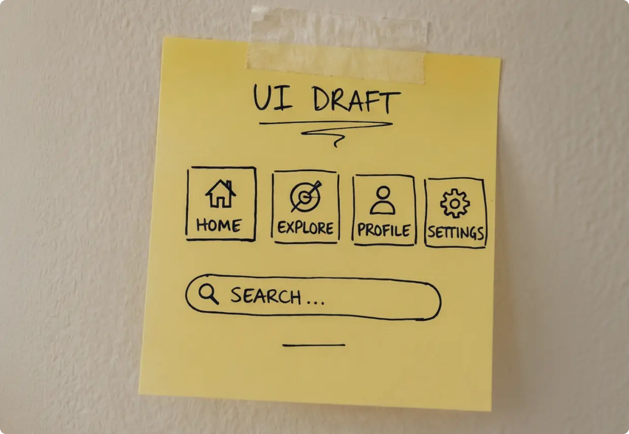
The 10-Second Test Your Startup Is Probably Failing
Ninety percent of startups fail within 3 to 5 years. Most die from poor market fit or cash flow problems, not bad design. But here’s the thing: a weak website won’t save a bad product. It will, however, kill a good one.
Visitors decide whether to stay or leave in under 10 seconds. That’s not a metaphor. That’s the actual window your homepage has to answer one question: Why should I care?
The shift most startups haven’t made yet is treating their website as a sales engine, not a digital brochure. A brochure sits on a shelf. A sales engine works around the clock to move strangers toward a decision. Design can’t fix strategic confusion, and no amount of animation or gradient backgrounds changes that. Strategy comes first. Pixels follow.
Here’s where most startups go wrong, and how to fix it.

The 5 Startup Web Design Mistakes That Kill Conversions
1. Kitchen-Sink Homepages
The homepage tries to do everything at once: product demo, pricing table, case studies, blog preview, job listings, and a chatbot. The result? Visitors freeze. When everything is a priority, nothing is.
Every page needs one clear purpose. Your homepage is not a sitemap.
Think about the three types of visitors landing on your site. The Curious just heard about you and needs a clear overview. The Ready-to-Try already wants in and needs a frictionless path to sign up. The Needs-Proof is skeptical and wants case studies or testimonials before committing. A kitchen-sink homepage fails all three because it’s optimized for none of them.
Fix: Build dedicated landing pages for each visitor type. Let your homepage handle the overview and route people quickly to where they need to go.
2. Vague Headlines
“Transform your business.” “Work smarter, not harder.” “The future of [industry].” These headlines say nothing. They could belong to any company, in any category, selling anything.
Compare that to: “Automate your invoicing in 5 minutes.” That’s specific. That’s a promise. That’s a reason to keep reading.
Apply the 5-second clarity test: show your homepage to someone who has never heard of your company. After five seconds, ask them what you do. If they can’t answer clearly, your headline is the problem.
Fix: Write headlines around specific outcomes, not vague aspirations. Name the result, name the timeframe, name who it’s for.
3. Generic Templates
Same purple-to-blue gradient. Same stock photo of a team laughing in an open office. Same “We help businesses grow” copy. If your site looks like every other startup in your category, you’ve already lost the trust battle before it started.
Studies consistently show that unique brand positioning outperforms generic presentation on conversion rates. Visitors aren’t just evaluating your product. They’re evaluating whether they believe in you.
Fix: Lead with your origin story and your actual differentiators. Why did you build this? What do you do that no one else does? Authentic positioning converts better than polished sameness.
4. Desktop-Only Thinking
Most discovery happens on mobile. A first-time visitor finds your startup through a social post, a newsletter, or a search result, and they’re almost certainly on their phone. But the site was designed on a 27-inch monitor.
Mobile-first design is not optional in 2026. It’s table stakes. That means buttons with a minimum 44px touch target (so thumbs can actually tap them), readable text without pinching, and performance that doesn’t punish users on 4G.
Your Core Web Vitals targets: LCP under 2.5 seconds, INP under 200ms, CLS under 0.1. These aren’t just SEO metrics. They’re the difference between a visitor who stays and one who bounces before your hero section loads.
Fix: Design mobile first, then scale up to desktop. Test on real devices, not just browser previews.
5. Jargon Overload
Every industry has its language. The mistake is assuming your visitors share it. “End-to-end API orchestration” means something to your engineering team. It means nothing to the operations director who just needs to know if your tool connects to Salesforce.
Fix: Write your homepage copy so that a 12-year-old could understand what you do and why it matters. That’s not dumbing it down. That’s respecting your visitor’s time.
A practical test: read your homepage out loud to someone outside your industry. Watch their face. If they look confused, rewrite it.
Let’s get started! Contact us today to discover how we can help.
The Pre-Launch Checklist (What You Actually Need)
Skip the 200-point audit. These are the items that actually matter before you go live.
Strategy and Content
- One-sentence value proposition that passes the 5-second test
- Headlines with specific, measurable outcomes
- Social proof: logos, testimonials, or early customer results
- Origin story that sets you apart from every other option
Technical Performance
- Core Web Vitals optimized: LCP under 2.5s, CLS under 0.1
- Mobile-first design tested on real devices (not just Chrome DevTools)
- 44px minimum button size for touch targets
- Page load under 3 seconds on a 4G connection
SEO Baseline
- Unique meta titles and descriptions on every page
- XML sitemap submitted to Google Search Console
- Schema markup for Organization and Product
- Mobile-friendly test passed
Security and Legal
- HTTPS on every page, no exceptions
- Privacy policy and cookie consent in place
- Multi-factor authentication enabled for admin access
QA Rehearsal
- Full demo-to-signup flow tested end to end
- Payment and form flows confirmed working on mobile
- Analytics tracking verified before launch day
Your website is never finished. It’s a living sales engine that should improve every single week.
The Traction Benchmarks: Know Your Milestones
A website launch is not a finish line. It’s the start of a measurement cycle. Here are the benchmarks worth tracking.
The 50-100-500 Rule: Aim for 50 active users who genuinely love your product, 100 paying customers, and 500 qualified prospects in your pipeline. These three numbers tell you whether your site is doing its job.
The 3-2-2 Rule (SaaS): Triple your revenue for two consecutive years, then double it for the next three. Your website is a core driver of that growth curve, not a passive bystander.
A standard startup site takes 4 to 8 weeks from strategy to launch. After that, run a 30/60/90-day optimization plan. Use analytics and heatmaps to find where visitors drop off, then fix it. Repeat.
Ship, Then Improve
Launch with strategic clarity, technical performance, and clear calls to action. Then let real users show you what to fix. Analytics will tell you where they drop off. Heatmaps will show you what they ignore. Session recordings will reveal the friction points no internal review ever catches.
The startups winning with their website design in 2026 are not the ones with the most beautiful sites. They’re the ones treating their website as a sales engine, shipping fast, and improving weekly based on real data.
Startups don’t die from launching too early.
They die from waiting too long for perfect.
If you want to build a startup website that actually converts, not just one that looks good in a portfolio, Bright Nation is the strategic partner to get you there. Let’s talk about your project.