Web Design Mistakes That Kill Conversions


This article breaks down the five most damaging web design mistakes, from visual chaos and navigation confusion to weak CTAs and slow load times, and shows exactly how a website sitemap strategy prevents each one.
Structure Before Pixels
Most web projects start in the wrong place. A designer opens Figma, picks a color palette, and starts building pages. The result looks polished. It might even win a design award. But users land on it, can’t find what they need, and leave within seconds.
That is not a design problem. It is a structure problem.
A strategic sitemap is your blueprint before a single pixel gets placed. It defines what pages exist, how they connect, and how users move through your site toward a conversion. Skip this step and you are building on sand. Every other mistake covered here traces back to this one root cause: building without structure.
Here are the five web design mistakes that consistently kill performance, and the structural approach that prevents each one.
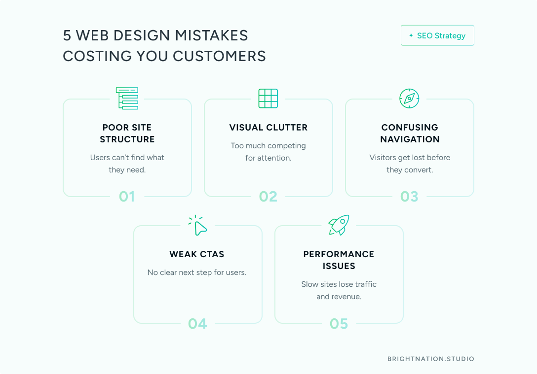
The 5 Web Design Mistakes That Kill Performance
1. No Clear Sitemap: The “Lost in Library” Problem
Imagine walking into a library where books are shelved randomly, with no sections, no signs, and no catalog. You know the information exists somewhere. You just cannot find it. That is what a structureless website feels like to a first-time visitor.
Building without a sitemap produces scattered content, redundant pages, and navigation that makes no logical sense to anyone except the person who built it.
The fix starts with the 3-click rule: every piece of essential information on your site should be reachable within three clicks from the homepage. If a prospect cannot find your pricing or contact page in three clicks, you are losing them.
You actually need three types of sitemaps working together:
Visual sitemap: Built in Figma or Miro during the planning phase. This maps the user journey and informs UX decisions before design begins.
XML sitemap: Submitted to search engines so crawlers can index every page efficiently. Critical for SEO.
HTML sitemap: A user-facing page that acts as a navigation backup, especially useful for large sites.
Here is a clean example structure for a B2B SaaS company:
Homepage → Product → Solutions → Resources → About → Legal
To build yours: run a content audit to identify what pages you need, group related content into logical clusters, sketch the hierarchy, then test it with real users using tree testing before design begins.
Clutter creates confusion. When everything asks for attention, users do not know where to look — so they leave.
2. Visual Chaos: Cognitive Overload
Cluttered pages overwhelm users. When every element competes for attention, nothing wins. Users scan, feel confused, and bounce.
The structural solution is a grid system. CSS Grid and Bootstrap create visual order and proportion, giving every element its place. White space is not empty space; it is a design tool that guides the eye toward what matters.
Consistency matters just as much. Your fonts, colors, spacing, and component styles should be identical across every page. When users move through your site and the visual language shifts, trust erodes. A design system, even a simple one, solves this before it becomes a problem.
3. Navigation Confusion
Cluttered menus packed with internal jargon are one of the most common web design mistakes. Your team knows what “Platform Overview” means. Your prospects do not.
Simplify the menu structure. Remove options that see little traffic. Use plain language that matches how your customers actually describe what they are looking for.
Here is a quick test: hand your site to someone who has never seen it and ask them to find your contact page and pricing. If it takes more than ten seconds, your navigation needs work.
Visitors who do not know what to do next simply leave. A page without a clear call to action is a dead end.
4. Weak or Missing CTAs
Every page on your site should have one primary action. Not three. Not a footer link buried below the fold. One clear, visible CTA placed above the fold and logically reinforced as the user scrolls.
Examples that work: “Get Started,” “Book a Demo,” “Download the Guide.” The label should match where the user is in their journey. A product page warrants “Book a Demo.” A resources page warrants “Download the Guide.”
If your CTA is an afterthought, your conversion rate will reflect that.
5. Technical Performance Issues
A one-second delay in page load time can reduce conversions by 7%. Users on mobile will wait roughly three seconds before abandoning a site entirely. Speed is not a technical nicety; it is a revenue issue.
Common culprits: heavy JavaScript and CSS files, too many HTTP requests, and unoptimized images. The fixes are concrete. Minify your code, convert images to WebP format, reduce third-party requests, and use a CDN to serve assets closer to your users.
Security belongs in this category too. Outdated plugins, no firewall, and weak authentication are not just IT concerns; they are business risks. Regular software updates, a Web Application Firewall (WAF), and strong authentication protocols should be non-negotiable from day one.

Let’s get started! Contact us today to discover how we can help.
The Details That Separate Good Sites from High-Performing Ones
Custom 404 pages are one of the most overlooked conversion opportunities. When a user hits a dead link, a generic error page sends them straight to the back button. A well-designed 404 page uses your brand voice, acknowledges the error with personality, and provides helpful links back to your most valuable content. It turns a dead end into a redirect.
Accessibility is both a legal requirement and a business advantage. Semantic HTML, alt text on images, and keyboard navigation support users with disabilities, but they also improve SEO and usability for everyone. Accessible sites load faster, rank better, and serve a wider audience. There is no downside.
Mobile-first structure is not optional when the majority of web traffic comes from mobile devices. Your sitemap needs to be designed for thumb navigation from the start, not adapted for mobile as an afterthought.
Plain language throughout navigation and content reduces friction. If users have to decode your labels, they will not bother.
Sites with slow load times, poor accessibility, and confusing navigation see bounce rates above 70%. Sites that get these details right consistently outperform benchmarks across every metric that matters.
The High-Performance Design Checklist
Use this before, during, and after every web project.
Before design starts:
- Content audit completed (every page identified and justified)
- Visual sitemap created with user journey mapped
- XML sitemap planned for search engine crawlers
- 3-click rule verified across all essential pages
During design:
- Grid system applied for visual order and proportion
- One clear CTA defined for every page
- Consistent design language across all pages (fonts, colors, spacing)
- Plain language used in all navigation labels
Technical requirements:
- Page load time under 3 seconds
- Mobile-first responsive design
- Security-first approach: updates, WAF, strong authentication
- Accessibility standards met: semantic HTML, alt text, keyboard navigation
- Custom 404 page with helpful redirects
Structure Prevents Chaos
The difference between a site that converts and one that confuses comes down to structure. Start with a strategic sitemap that maps the user journey, then build the visual and technical layers on that foundation. When structure is sound, design becomes easier, navigation becomes intuitive, and conversions become inevitable.
At Bright Nation Studio, we start every project with structure before pixels. If your current site is underperforming, the problem is almost certainly structural. We can help you diagnose it and build something that actually works. Talk to our team today.